Chapter 12 Data Visualization
This chapter is based in big part on the chapter on visualization by the folks at Northwestern. Please be check that link if you want to dive into how to make even cooler graphs than the ones we will cover here.
We will learn basic tools to visualize our data. By visualizing our data, we gain valuable insights that we couldn’t initially see from just looking at the raw data in spreadsheet form. We will use the ggplot2 package as it provides an easy way to customize your plots. ggplot2 is rooted in the data visualization theory known as The Grammar of Graphics (wilkinson2005?).
At the most basic level, graphics/plots/charts (we use these terms interchangeably in this guide) provide a nice way for us to get a sense for how quantitative variables compare in terms of their center (where the values tend to be located) and their spread (how they vary around the center). Graphics should be designed to emphasize the findings and insight you want your audience to understand. This does however require a balancing act. On the one hand, you want to highlight as many meaningful relationships and interesting findings as possible; on the other you don’t want to include so many as to overwhelm your audience.
As we will see, plots/graphics also help us to identify patterns in our data. We will see that a common extension of these ideas is to compare the distribution of one quantitative variable (i.e., what the spread of a variable looks like or how the variable is distributed in terms of its values) as we go across the levels of a different categorical variable.
Needed data and packages
Let’s load all the packages and data needed for this chapter (this assumes you’ve already installed them). Read Section 11.6 for information on how to install and load R packages. As before, we will load the atlas dataset as well. We will also plot some of the information in the package gapminder for some of our examples.
atlas <- readRDS(gzcon(url("https://raw.githubusercontent.com/jrm87/ECO3253_repo/master/data/atlas.rds")))12.1 The Grammar of Graphics
We begin with a discussion of a theoretical framework for data visualization known as “The Grammar of Graphics,” which serves as the foundation for the ggplot2 package. Think of how we construct sentences in English to form sentences by combining different elements, like nouns, verbs, particles, subjects, objects, etc. However, we can’t just combine these elements in any arbitrary order; we must do so following a set of rules known as a linguistic grammar. Similarly to a linguistic grammar, “The Grammar of Graphics” define a set of rules for constructing statistical graphics by combining different types of layers. This grammar was created by Leland Wilkinson (wilkinson2005?) and has been implemented in a variety of data visualization software including R.
12.1.1 Components of the Grammar
In short, the grammar tells us that:
A statistical graphic is a
mappingofdatavariables toaesthetic attributes ofgeometric objects.
Specifically, we can break a graphic into the following three essential components:
data: the data set composed of variables that we map.geom: the geometric object in question. This refers to the type of object we can observe in a plot. For example: points, lines, and bars.aes: aesthetic attributes of the geometric object. For example, x-position, y-position, color, shape, and size. Each assigned aesthetic attribute can be mapped to a variable in our data set.
You might be wondering why we wrote the terms data, geom, and aes in a computer code type font. We’ll see very shortly that we’ll specify the elements of the grammar in R using these terms. However, let’s first break down the grammar with an example unrelated to our mobility data, but worry not! We will return to the atlas data. First…
12.1.2 Gapminder data
In February 2006, a statistician named Hans Rosling gave a TED talk titled “The best stats you’ve ever seen” where he presented global economic, health, and development data from the website gapminder.org. For example, for the 142 countries included from 2007, let’s consider only the first 6 countries when listed alphabetically in Table 12.1.
| Country | Continent | Life Expectancy | Population | GDP per Capita |
|---|---|---|---|---|
| Afghanistan | Asia | 43.8 | 31889923 | 975 |
| Albania | Europe | 76.4 | 3600523 | 5937 |
| Algeria | Africa | 72.3 | 33333216 | 6223 |
| Angola | Africa | 42.7 | 12420476 | 4797 |
| Argentina | Americas | 75.3 | 40301927 | 12779 |
| Australia | Oceania | 81.2 | 20434176 | 34435 |
Each row in this table corresponds to a country in 2007. For each row, we have 5 columns:
- Country: Name of country.
- Continent: Which of the five continents the country is part of. (Note that “Americas” includes countries in both North and South America and that Antarctica is excluded.)
- Life Expectancy: Life expectancy in years.
- Population: Number of people living in the country.
- GDP per Capita: Gross domestic product (in US dollars).
Now consider Figure 12.1, which plots this data for all 142 countries in the data.
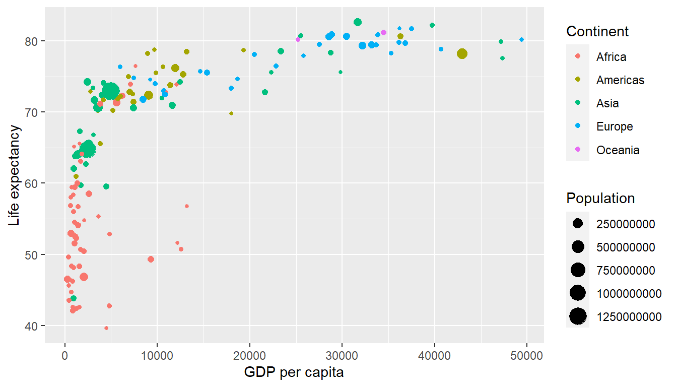
Figure 12.1: Life Expectancy over GDP per Capita in 2007
Let’s view this plot through the grammar of graphics:
- The
datavariable GDP per Capita gets mapped to thex-positionaesthetic of the points. - The
datavariable Life Expectancy gets mapped to they-positionaesthetic of the points. - The
datavariable Population gets mapped to thesizeaesthetic of the points. - The
datavariable Continent gets mapped to thecoloraesthetic of the points.
We’ll see shortly that data corresponds to the particular data frame where our data is saved and a “data variable” corresponds to a particular column in the data frame. Furthermore, the type of geometric object considered in this plot are points. That being said, while in this example we are considering points, graphics are not limited to just points. Other plots involve lines while others involve bars.
Let’s summarize the three essential components of the Grammar in Table 12.2.
| data variable | aes | geom |
|---|---|---|
| GDP per Capita | x | point |
| Life Expectancy | y | point |
| Population | size | point |
| Continent | color | point |
12.1.3 Other components
There are other components of the Grammar of Graphics we can control as well. As you start to delve deeper into the Grammar of Graphics, you’ll start to encounter these topics more frequently. In this book however, we’ll keep things simple and only work with the two additional components listed below:
faceting breaks up a plot into small multiples corresponding to the levels of another variable (Section ??)positionadjustments for barplots (Section 12.5)
Other more complex components like scales and coordinate systems are left for a more advanced text such as R for Data Science (rds2016?). Generally speaking, the Grammar of Graphics allows for a high degree of customization of plots and also a consistent framework for easily updating and modifying them.
12.1.4 ggplot2 package
In this book, we will be using the ggplot2 package for data visualization, which is an implementation of the Grammar of Graphics for R (Wickham et al. 2022). As we noted earlier, a lot of the previous section was written in a computer code type font. This is because the various components of the Grammar of Graphics are specified in the ggplot() function included in the ggplot2 package, which expects at a minimum as arguments (i.e. inputs):
- The data frame where the variables exist: the
dataargument. - The mapping of the variables to aesthetic attributes: the
mappingargument which specifies theaesthetic attributes involved.
After we’ve specified these components, we then add layers to the plot using the + sign. The most essential layer to add to a plot is the layer that specifies which type of geometric object we want the plot to involve: points, lines, bars, and others. Other layers we can add to a plot include layers specifying the plot title, axes labels, visual themes for the plots, and facets (which we’ll see in Section ??).
Let’s now put the theory of the Grammar of Graphics into practice.
12.2 Three Important Graphs -
In order to keep things simple, we will only focus on 3 types of graphics in this section, each with a commonly given name.
- scatterplots
- histograms
- barplots
We will discuss some variations of these plots, but with this basic repertoire of graphics in your toolbox you can visualize a wide array of different variable types. Note that certain plots are only appropriate for categorical variables and while others are only appropriate for quantitative variables. You’ll want to quiz yourself often as we go along on which plot makes sense a given a particular problem or data set.
12.3 Scatterplots
The simplest of the figrue we will cover are scatterplots, also called bivariate plots. They allow you to visualize the relationship between two numerical variables. While you may already be familiar with scatterplots, let’s view them through the lens of the Grammar of Graphics. Specifically, we will visualize the relationship across neighborhoods between the following two numerical variables in the atlas data frame:
kfr_pooled_p25: upward mobility for children with parents on the percentile 25 on the horizontal “y” axismed_hhinc2016: median household income in 2016 on the vertical “x” axis
12.3.1 Scatterplots via geom_point
Let’s now go over the code that will create the desired scatterplot, keeping in mind our discussion on the Grammar of Graphics in Section 12.1. We’ll be using the ggplot() function included in the ggplot2 package.
Let’s break this down piece-by-piece:
- Within the
ggplot()function, we specify two of the components of the Grammar of Graphics as arguments (i.e. inputs):- The
dataframe to beatlasby settingdata = atlas. - The
aestheticmappingby settingaes(x = med_hhinc2016, y = kfr_pooled_p25). Specifically:- the variable
med_hhinc2016maps to thexposition aesthetic - the variable
kfr_pooled_p25maps to theyposition aesthetic
- the variable
- The
- We add a layer to the
ggplot()function call using the+sign. The layer in question specifies the third component of the grammar: thegeometric object. In this case the geometric object are points, set by specifyinggeom_point().
After running the above code, you’ll notice two outputs: a warning message and the graphic shown in Figure 12.2. Let’s first unpack the warning message: “y” axis
## Warning: Removed 1372 rows containing missing values (`geom_point()`).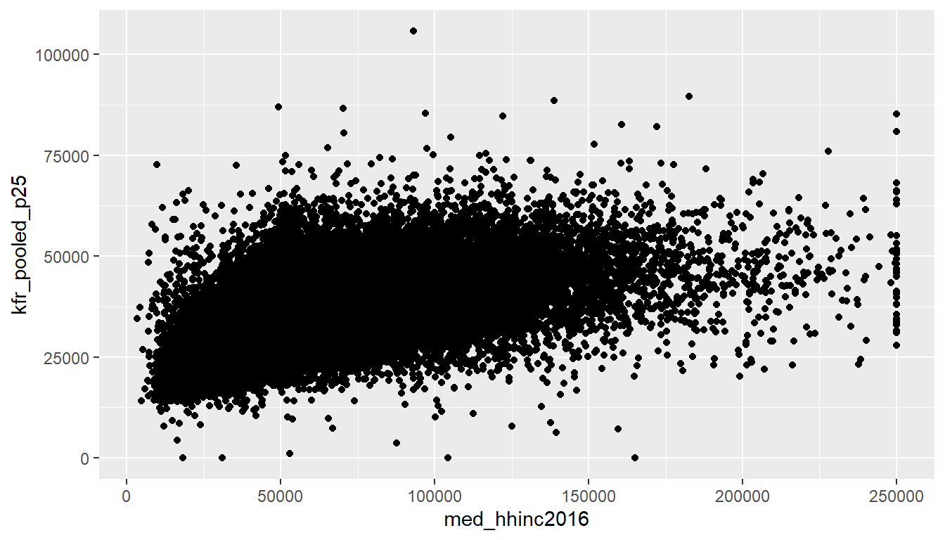
Figure 12.2: Median Household Income in 2016 vs Mobility for Children with Parents in Percentile 25
After running the above code, R returns a warning message alerting us to the fact that 1372 rows were ignored due to them being missing. For 1372 rows either the value for med_hhinc2016 or kfr_pooled_p25 or both were missing (recorded in R as NA), and thus these rows were ignored in our plot. Turning our attention to the resulting scatterplot in Figure 12.2, we see that a positive relationship exists between med_hhinc2016 and kfr_pooled_p25: as the median income level of the neighborhood increases, the mobility for children of parents in the percentile 25 tend to also increase.
Before we continue, let’s consider a few more notes on the layers in the above code that generated the scatterplot:
- Note that the
+sign comes at the end of lines, and not at the beginning. You’ll get an error in R if you put it at the beginning. - When adding layers to a plot, you are encouraged to start a new line after the
+so that the code for each layer is on a new line. As we add more and more layers to plots, you’ll see this will greatly improve the legibility of your code. - To stress the importance of adding layers in particular the layer specifying the
geometric object, consider Figure 12.3 where no layers are added. A not very useful plot!
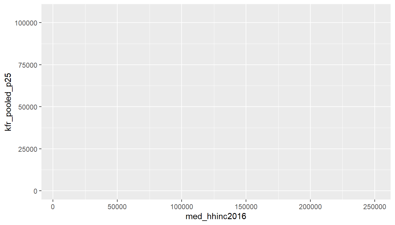
Figure 12.3: Plot with No Layers
Learning check
(LC3.1) What are some other features of the plot that stand out to you?
(LC3.2) Create a new scatterplot using different variables in the atlas data frame by modifying the example above.
12.3.2 Over-plotting
Sometimes you end up with a large mass of points, which can cause some confusion as it is hard to tell the true number of points that are plotted. This is the result of a phenomenon called overplotting. As one may guess, this corresponds to values being plotted on top of each other over and over again. It is often difficult to know just how many values are plotted in this way when looking at a basic scatterplot as we have here. The main methods to address the issue of overplotting is:
- By adjusting the transparency of the points.
Changing the transparency
The main way of addressing overplotting is by changing the transparency of the points by using the alpha argument in geom_point(). By default, this value is set to 1. We can change this to any value between 0 and 1, where 0 sets the points to be 100% transparent and 1 sets the points to be 100% opaque. Note how the following code is identical to the code in Section 12.3 that created the scatterplot with overplotting, but with alpha = 0.2 added to the geom_point():
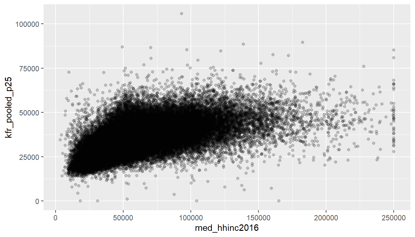
Figure 12.4: Delay scatterplot with alpha=0.2
The key feature to note in Figure 12.4 is that the transparency of the points is cumulative: areas with a high-degree of overplotting are darker, whereas areas with a lower degree are less dark. Note furthermore that there is no aes() surrounding alpha = 0.2. This is because we are not mapping a variable to an aesthetic attribute, but rather merely changing the default setting of alpha. In fact, you’ll receive an error if you try to change the second line above to read geom_point(aes(alpha = 0.2)).
Learning check
(LC3.3) Why is setting the alpha argument value useful with scatterplots? What further information does it give you that a regular scatterplot cannot?
12.3.3 Summary
Scatterplots display the relationship between two numerical variables. They are among the most commonly used plots because they can provide an immediate way to see the trend in one variable versus another. However, if you try to create a scatterplot where either one of the two variables is not numerical, you might get strange results. Be careful!
With medium to large data sets, you may need to play around with the different modifications one can make to a scatterplot. This tweaking is often a fun part of data visualization, since you’ll have the chance to see different relationships come about as you make subtle changes to your plots.
Last thing: remember Figure 12.1? Here is the code of how we did that. It has a few pieces that you would need to figure out on your own, but you should get the essence by now. In particular, in the first line we pass on a filtered data for the year 2007. I’ll explain that more in the next Section 13 on Data Wrangling. Still, try it out!
ggplot(data = gapminder%>%filter(year == 2007), mapping = aes(x=gdpPercap, y=lifeExp, size=pop, col=continent)) +
  geom_point() +
  labs(x = "GDP per capita", y = "Life expectancy")
12.4 Histograms
Let’s consider the kfr_pooled_p25 variable in the atlas data frame once again, but now we want to understand how the values of kfr_pooled_p25 distribute. In other words, for economic mobility for children from parents in the percentile 25:
- What are the smallest and largest values?
- What is the “center” value?
- How do the values spread out?
- What are frequent and infrequent values?
One way to visualize this distribution of this single variable kfr_pooled_p25 is to plot what is know as a histogram. A histogram is a plot that visualizes the distribution of a numerical value as follows:
- We first cut up the x-axis into a series of bins, where each bin represents a range of values.
- For each bin, we count the number of observations that fall in the range corresponding to that bin.
- Then for each bin, we draw a bar whose height marks the corresponding count.
Let’s drill-down on an example of a histogram, shown in Figure 12.5.
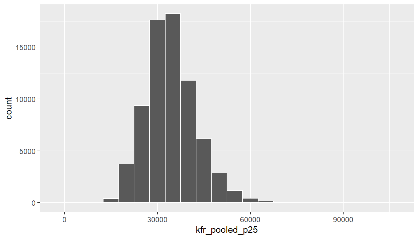
Figure 12.5: Example histogram.
Observe that there are six bins of equal width between $ 30,000 and $ 60,000, thus we have three bins of width $ 5,000 each: one bin for the 30-35k range, and so on, until the bin for the 55-60k range. Since:
- The bin for the 30-35k range has a height of around 9000, this histogram is telling us that around 9000 neighborhoods in the US have an average mobility measure for children of parents in the percentile 25th of between $30,000 and $35,000.
The remaining bins all have a similar interpretation.
12.4.1 Histograms via geom_histogram
Let’s now present the ggplot() code to plot your first histogram! Unlike with scatterplots and linegraphs, there is now only one variable being mapped in aes(): the single numerical variable temp. The y-aesthetic of a histogram gets computed for you automatically. Furthermore, the geometric object layer is now a geom_histogram()
## `stat_bin()` using `bins = 30`. Pick better value with `binwidth`.## Warning: Removed 1267 rows containing non-finite values (`stat_bin()`).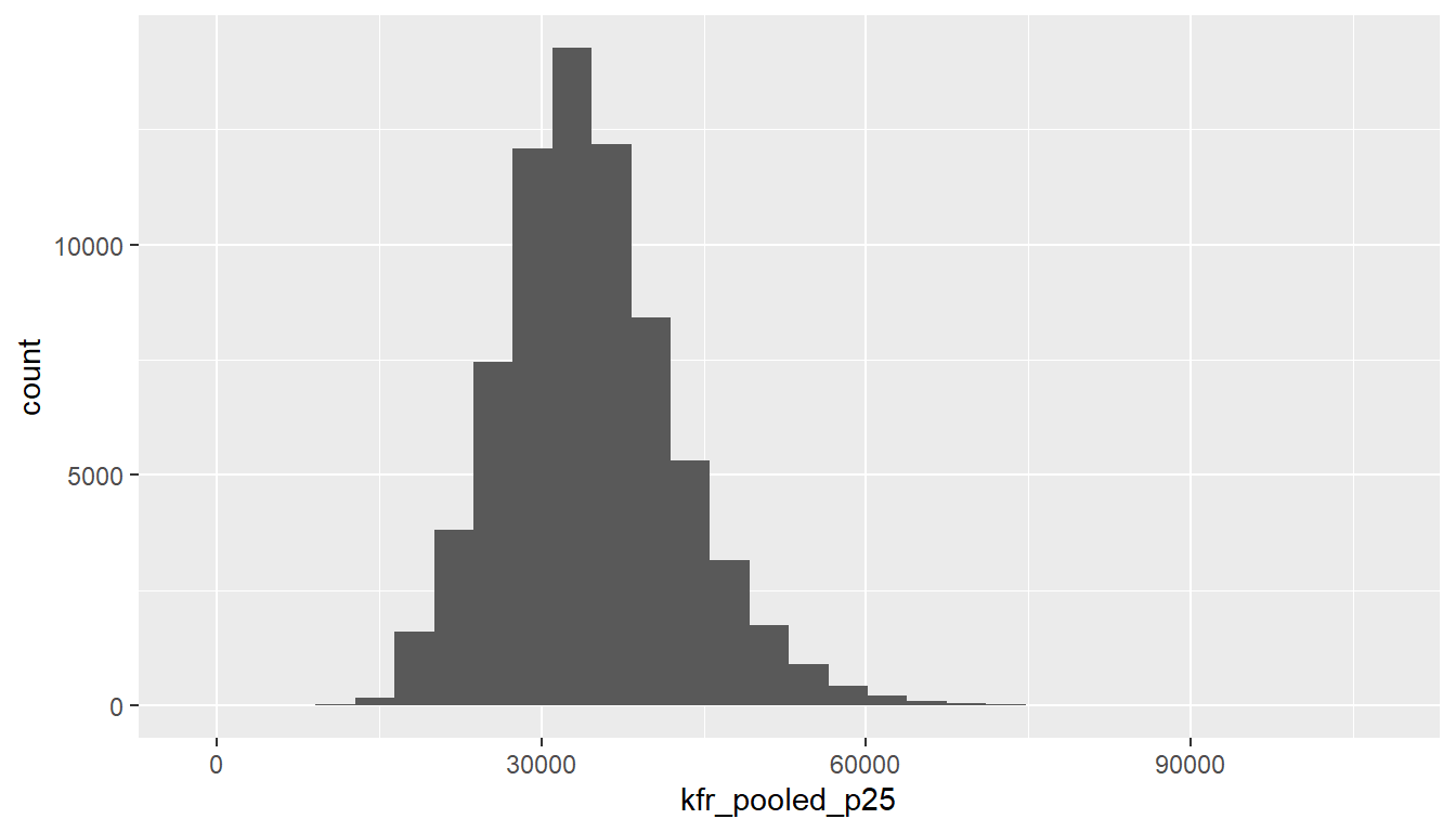
Figure 12.6: Histogram of mobility for children of p25 in the US.
Let’s unpack the messages R sent us first. The first message is telling us that the histogram was constructed using bins = 30, in other words 30 equally spaced bins. This is known in computer programming as a default value; unless you override this default number of bins with a number you specify, R will choose 30 by default. We’ll see in the next section how to change this default number of bins. The second message is telling us once again that there are some missing values: that because one row has a missing NA value for kfr_pooled_p25, it was omitted from the histogram. R is just giving us a friendly heads up that this was the case.
Now’s let’s unpack the resulting histogram in Figure 12.6. Observe that values less than $12,000 as well as values above $80,000 are rather rare. However, because of the large number of bins, its hard to get a sense for which range of temperatures is covered by each bin; everything is one giant amorphous blob. So let’s add white vertical borders demarcating the bins by adding a color = "white" argument to geom_histogram():
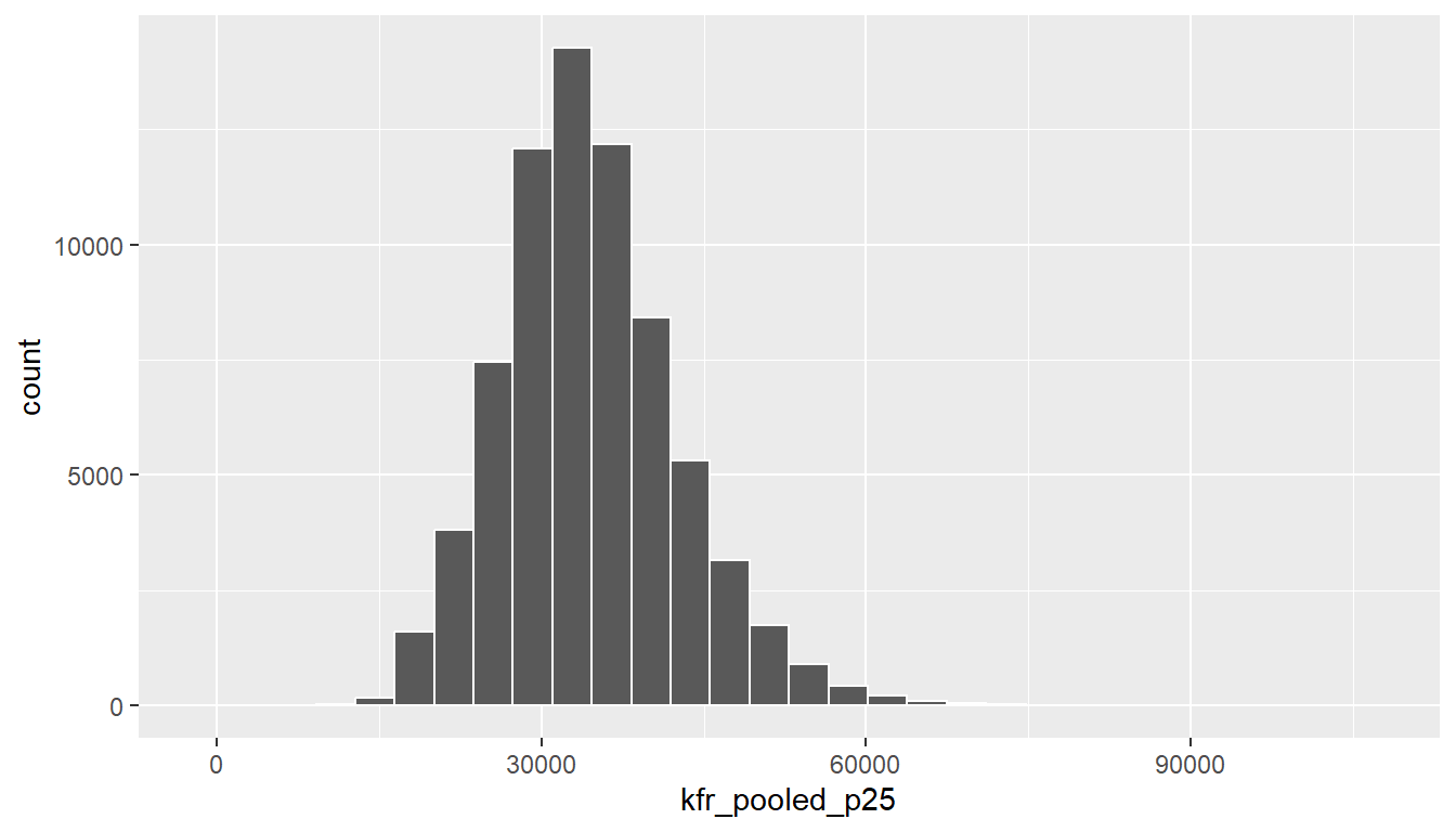
Figure 12.7: Histogram of mobility for children of p25 in the US with white borders.
We can now better associate ranges of mobility to each of the bins. We can also vary the color of the bars by setting the fill argument. Run colors() to see all 657 possible choice of colors!
ggplot(data = atlas, mapping = aes(x = kfr_pooled_p25)) +
  geom_histogram(color = "white", fill = "steelblue")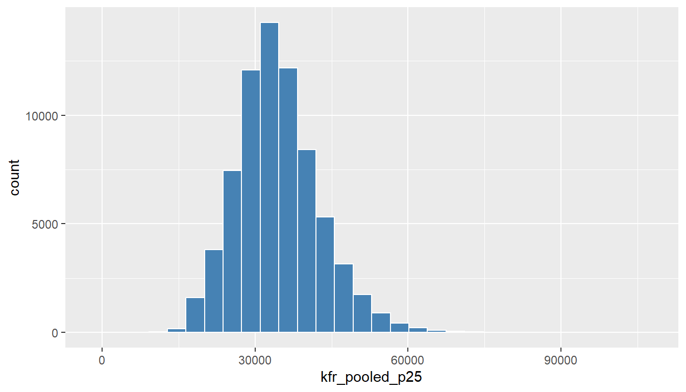
Figure 12.8: Histogram of mobility for children of p25 in the US with white borders.
12.4.2 Adjusting the bins
Let’s now adjust the number of bins in our histogram in one of two methods:
- By adjusting the number of bins via the
binsargument togeom_histogram(). - By adjusting the width of the bins via the
binwidthargument togeom_histogram().
Using the first method, we have the power to specify how many bins we would like to cut the x-axis up in. As mentioned in the previous section, the default number of bins is 30. We can override this default, to say 40 bins, as follows:
ggplot(data = atlas, mapping = aes(x = kfr_pooled_p25)) +
  geom_histogram(bins = 40, color = "white")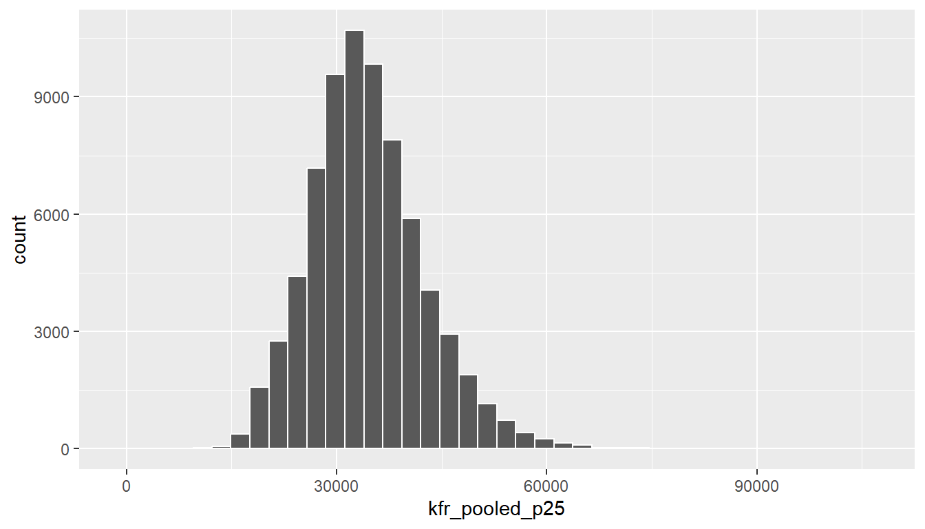
Figure 12.9: Histogram with 40 bins.
Using the second method, instead of specifying the number of bins, we specify the width of the bins by using the binwidth argument in the geom_histogram() layer. For example, let’s set the width of each bin to be 10°F.
ggplot(data = atlas, mapping = aes(x = kfr_pooled_p25)) +
  geom_histogram(binwidth = 4000, color = "white")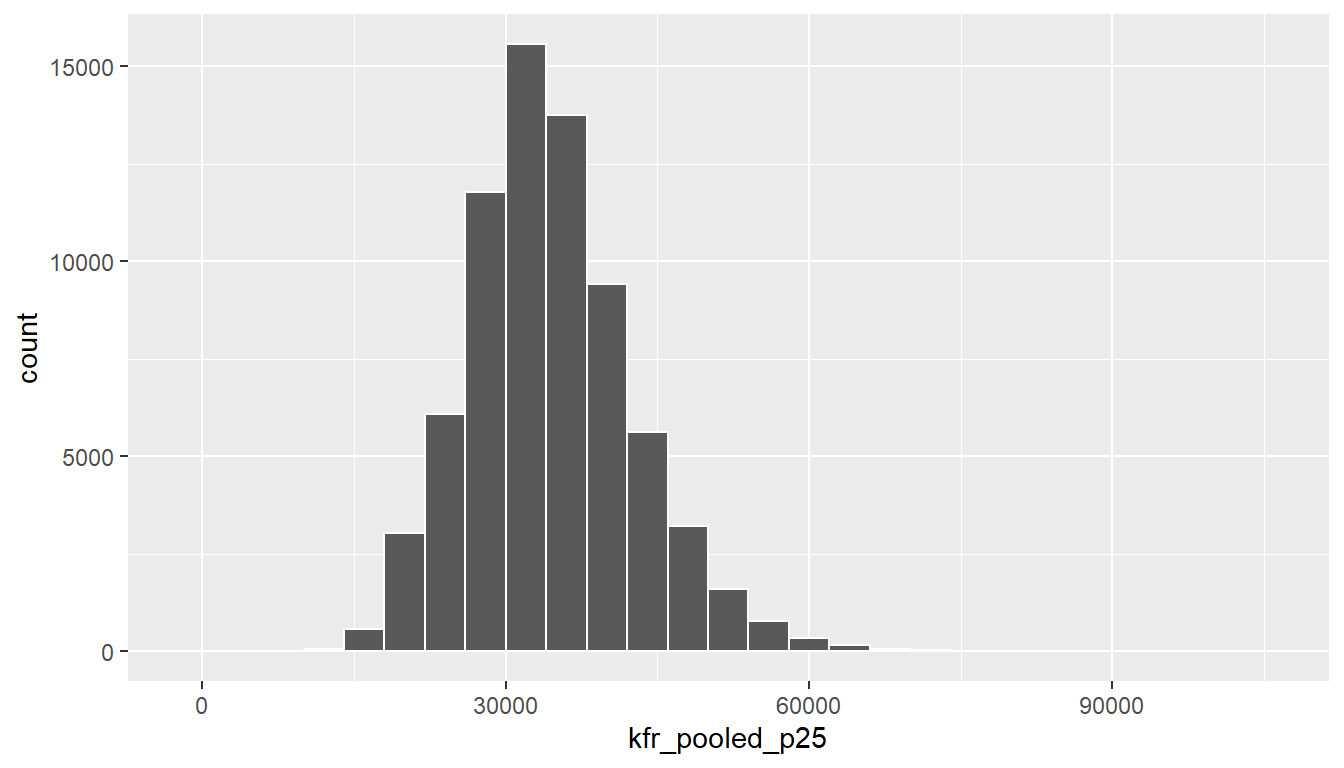
Figure 12.10: Histogram with binwidth 10.
Learning check
(LC3.4) What does changing the number of bins from 30 to 40 tell us about the distribution of mobility?
(LC3.5) Would you classify the distribution of mobility as symmetric or skewed?
(LC3.6) What would you guess is the “center” value in this distribution? Why did you make that choice?
(LC3.7) Is this data spread out greatly from the center or is it close? Why?
12.5 Barplots
Histograms are tools to visualize the distribution of numerical variables. Another common task is visualize the distribution of a categorical variable. This is a simpler task, as we are simply counting different categories, also known as levels, of a categorical variable. Often the best way to visualize these different counts, also known as frequencies, is with a barplot (also known as a barchart). One complication, however, is how your data is represented: is the categorical variable of interest “pre-counted” or not? For example, run the following code that manually creates two data frames representing a collection of fruit: 3 apples and 2 oranges.
fruits <- data_frame(
  fruit = c("apple", "apple", "orange", "apple", "orange")
)
fruits_counted <- data_frame(
  fruit = c("apple", "orange"),
  number = c(3, 2)
)
We see both the fruits and fruits_counted data frames represent the same collection of fruit. Whereas fruits just lists the fruit individually…
## # A tibble: 5 × 1
##   fruit
##   <chr>
## 1 apple
## 2 apple
## 3 orange
## 4 apple
## 5 orange
… fruits_counted has a variable count which represents pre-counted values of each fruit.
## # A tibble: 2 × 2
##   fruit  number
##   <chr>   <dbl>
## 1 apple       3
## 2 orange      2
Depending on how your categorical data is represented, you’ll need to use add a different geom layer to your ggplot() to create a barplot, as we now explore.
12.5.1 Barplots via geom_bar or geom_col
Let’s generate barplots using these two different representations of the same basket of fruit: 3 apples and 2 oranges. Using the fruits data frame where all 5 fruits are listed individually in 5 rows, we map the fruit variable to the x-position aesthetic and add a geom_bar() layer.

Figure 12.11: Barplot when counts are not pre-counted
However, using the fruits_counted data frame where the fruit have been “pre-counted”, we map the fruit variable to the x-position aesthetic as with geom_bar(), but we also map the count variable to the y-position aesthetic, and add a geom_col() layer.
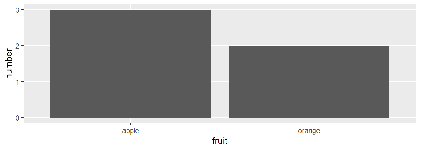
Figure 12.12: Barplot when counts are pre-counted
Compare the barplots in Figures 12.11 and 12.12. They are identical because they reflect count of the same 5 fruit. However depending on how our data is saved, either pre-counted or not, we must add a different geom layer. When the categorical variable whose distribution you want to visualize is:
- Is not pre-counted in your data frame: use
geom_bar(). - Is pre-counted in your data frame, use
geom_col()with the y-position aesthetic mapped to the variable that has the counts.
Let’s now go back to the atlas data frame and visualize the distribution of the categorical variable state. In other words, let’s visualize the number of neighborhoodsin the data belonging to each state. Recall from Section 11.7.4 when you first explored the atlas data frame you saw that each row corresponds to a neighborhood. In other words the atlas data frame is more like the fruits data frame than the fruits_counted data frame above, and thus we should use geom_bar() instead of geom_col() to create a barplot. Much like a geom_histogram(), there is only one variable in the aes() aesthetic mapping: the variable state gets mapped to the x-position.
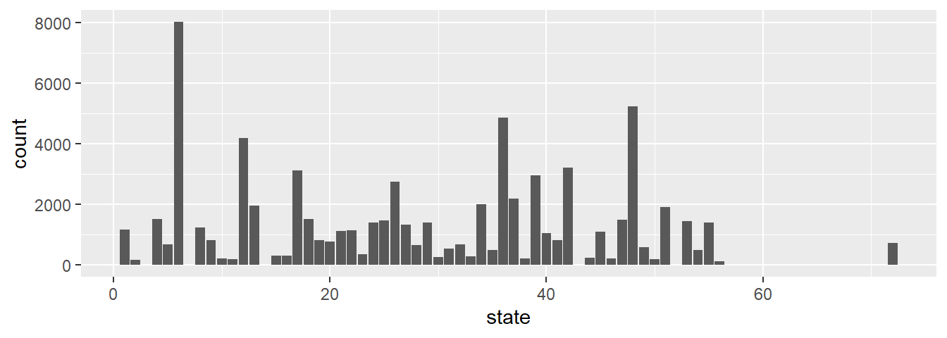
Figure 12.13: Number of neighborhoods by State in the atlas data using geom_bar
Observe in Figure 12.13 that state 06, which is California, has the most number of neighborhoods in the data. If you don’t know which State FIPS code correspond to which State, you can see it here. For example: TX is State 48, while NC is State 37.
Learning check
(LC3.8) Why are histograms inappropriate for visualizing categorical variables?
(LC3.9) What is the difference between histograms and barplots?
(LC3.10) How many neighborhoods are there in Texas in the atlas data?
12.5.2 Summary
Barplots are the preferred way of displaying the distribution of a categorical variable, or in other words the frequency with which the different categories called levels occur. They are easy to understand and make it easy to make comparisons across levels. When trying to visualize two categorical variables, you have many options: stacked barplots, side-by-side barplots, and faceted barplots. Depending on what aspect of the joint distribution you are trying to emphasize, you will need to make a choice between these three types of barplots.
12.6 Conclusion
12.6.1 Summary table
Let’s recap all five of the three main figures in Table ?? summarizing their differences. Using these 5NG, you’ll be able to visualize the distributions and relationships of variables contained in a wide array of datasets.
12.6.2 Argument specification
Run the following two segments of code. First this:
then this:
You’ll notice that that both code segments create the same barplot, even though in the second segment we omitted the data = and mapping = code argument names. This is because the ggplot() by default assumes that the data argument comes first and the mapping argument comes second. So as long as you specify the data frame in question first and the aes() mapping second, you can omit the explicit statement of the argument names data = and mapping =.
Going forward for the rest of this book, all ggplot() will be like the second segment above: with the data = and mapping = explicit naming of the argument omitted and the default ordering of arguments respected.
12.6.3 Additional resources
If you want to further unlock the power of the ggplot2 package for data visualization, you can check out RStudio’s “Data Visualization with ggplot2” cheatsheet. This cheatsheet summarizes much more than what we’ve discussed in this chapter, in particular the many more than the 3 geom geometric objects we covered in this Chapter, while providing quick and easy to read visual descriptions.
You can access this cheatsheet by going to the RStudio Menu Bar -> Help -> Cheatsheets -> “Data Visualization with ggplot2”:
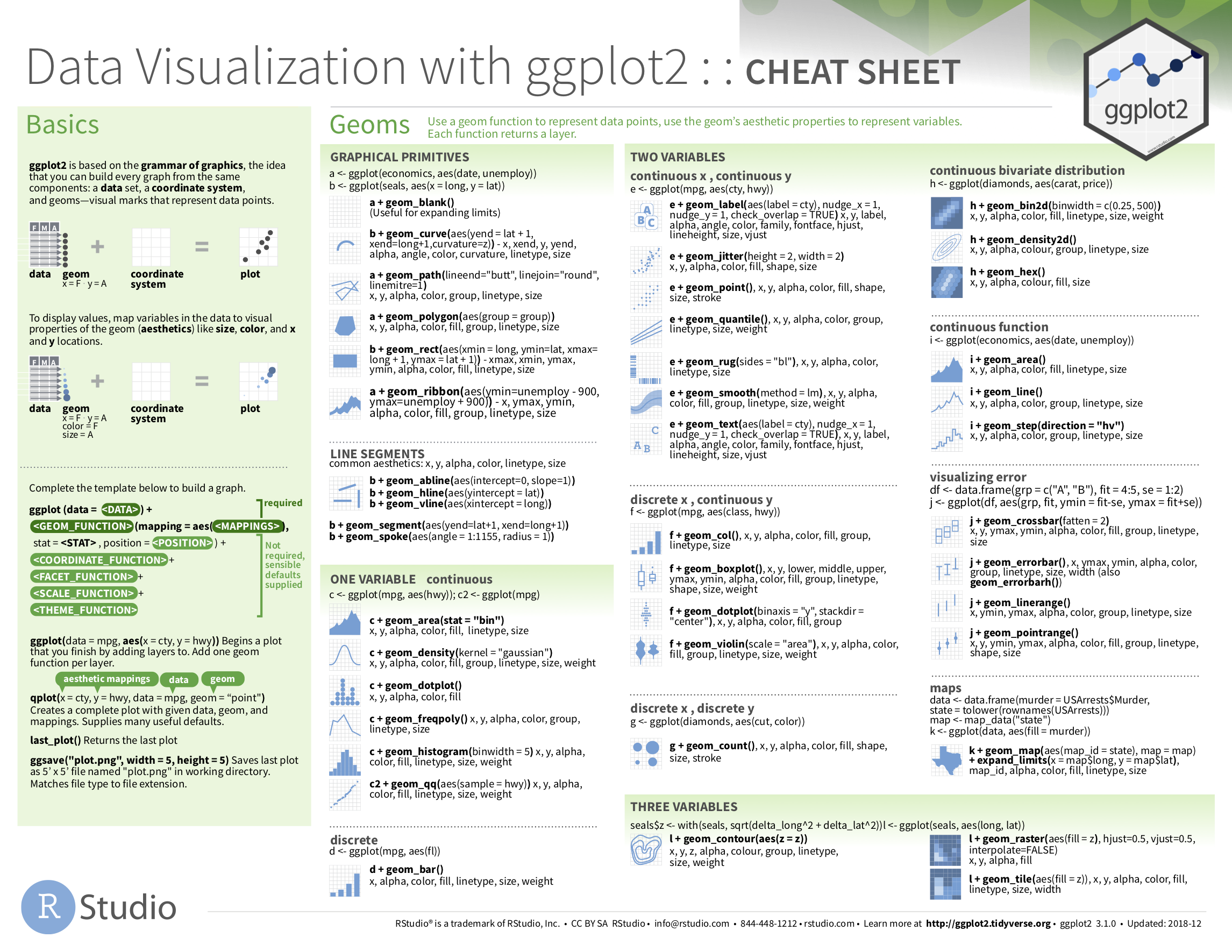
Figure 12.14: Data Visualization with ggplot2 cheatsheat