Chapter 14 Simple and Multivariate Regression
As a reminder, this is not a course on econometrics, so I will not delve deep into the issues of regression. Nonetheless, there are basic intuitions we can construct when analyzing the data with these models. I will summarize the main issues in this chapter. Nonetheless, feel free to dive deeper here.
Now that we are equipped with data visualization skills from Chapter 12, and data wrangling skills from Chapter 13, we now proceed with data modeling. The fundamental premise of data modeling is to make explicit the relationship between:
- an outcome variable \(y\), also called a dependent variable and
- an explanatory/predictor variable \(x\), also called an independent variable or covariate.
Another way to state this is using mathematical terminology: we will model the outcome variable \(y\) as a function of the explanatory/predictor variable \(x\). Why do we have two different labels, explanatory and predictor, for the variable \(x\)? That’s because roughly speaking data modeling can be used for two purposes:
- Modeling for prediction: You want to predict an outcome variable \(y\) based on the information contained in a set of predictor variables. You don’t care so much about understanding how all the variables relate and interact, but so long as you can make good predictions about \(y\), you’re fine. For example, if we know many individuals’ risk factors for lung cancer, such as smoking habits and age, can we predict whether or not they will develop lung cancer? Here we wouldn’t care so much about distinguishing the degree to which the different risk factors contribute to lung cancer, but instead only on whether or not they could be put together to make reliable predictions.
- Modeling for explanation: You want to explicitly describe the relationship between an outcome variable \(y\) and a set of explanatory variables, determine the significance of any found relationships, and have measures summarizing these. Continuing our example from above, we would now be interested in describing the individual effects of the different risk factors and quantifying the magnitude of these effects. One reason could be to design an intervention to reduce lung cancer cases in a population, such as targeting smokers of a specific age group with an advertisement for smoking cessation programs. In this course, we’ll focus more on this latter purpose.
Data modeling is used in a wide variety of fields, including statistical inference, causal inference, artificial intelligence, and machine learning. There are many techniques for data modeling, such as tree-based models, neural networks and deep learning, and supervised learning. We will briefly touch on those at the end of the course. For now, we’ll focus on one particular technique: linear regression, one of the most commonly-used and easy-to-understand approaches to modeling. Recall our discussion in Subsection 11.7.4 on numerical and categorical variables. Linear regression involves:
- an outcome variable \(y\) that is numerical and
- explanatory variables \(x_i\) (e.g. \(x_1, x_2, ...\)) that are either numerical or categorical.
With linear regression there is always only one numerical outcome variable \(y\) but we have choices on both the number and the type of explanatory variables to use. We’re going to cover the following regression scenarios:
- Only one explanatory variable: simple linear regression
- In Section 14.1, this explanatory variable will be a single numerical explanatory variable \(x\).
- In the next Section on Experiments we will use an explanatory variable that is a categorical explanatory variable \(x\) (being in a treatment or in a control). This is an example of a broader class of regressions using explanatory variables, but we will see those later.
- In Section 14.1, this explanatory variable will be a single numerical explanatory variable \(x\).
- More than one explanatory variable: multiple regression
- We’ll focus on two numerical explanatory variables, \(x_1\) and \(x_2\), in Section 14.3.
- We’ll use one numerical and one categorical explanatory variable. As before, we will see this in later sections.
We’ll study the first of each of these two types of regression scenarios using the atlas data!
Needed packages
Let’s now load all the packages needed for this chapter (this assumes you’ve already installed them). In this chapter we introduce some new packages:
- The
tidyverse“umbrella” package. You can load thetidyversepackage by runninglibrary(tidyverse), which loads several other packages we have used thus far, including:ggplot2for data visualizationdplyrfor data wrangling- As well as the more advanced
purrr,tidyr,readr,tibble,stringr, andforcatspackages
- The
skimr(R-skimr?) package, which provides a simple-to-use function to quickly compute a wide array of commonly-used summary statistics.
If needed, read Section 11.6 for information on how to install and load R packages. We will also load the atlas dataset.
library(tidyverse)
library(skimr)
atlas <- readRDS(gzcon(url("https://raw.githubusercontent.com/jrm87/ECO3253_repo/master/data/atlas.rds")))
14.1 One numerical explanatory variable
Let’s say you want to explore what correlates with economic mobility for children of poor parents (those at percentile 25 of the parental income distribution). To try to keep things simple, you want to understand if neighborhoods that have more jobs, tend to provide more or less economic mobility for this population. We will try to keep things simple for now and explain the differences in mobility with the average job growth rate between 2004 and 2013 (a rough measurement of how much jobs grow in that area) correlates with economic mobility for children from poor parents
We’ll achieve ways to address these questions by modeling the relationship between these two variables with a particular kind of linear regression called simple linear regression. Simple linear regression is the most basic form of linear regression. With it we have
- A numerical outcome variable \(y\). In this case, economic mobility for children of parents in the percentile 25.
- A single numerical explanatory variable \(x\). In this case, the average annual job growth rate between 2004 and 2013 for that neighborhood.
14.1.1 Exploratory data analysis
A crucial step before doing any kind of modeling or analysis is performing an exploratory data analysis, or EDA, of all our data. Exploratory data analysis can give you a sense of the distribution of the data and whether there are outliers and/or missing values. Most importantly, it can inform how to build your model. There are many approaches to exploratory data analysis; here are three:
- Most fundamentally: just looking at the raw values, in a spreadsheet for example. While this may seem trivial, many people ignore this crucial step!
- Computing summary statistics like means, medians, and standard deviations.
- Creating data visualizations.
Let’s load the atlas data, select only a subset of the variables (including the ‘names’, which are the codes of tract, country and state), and look at the raw values. Recall you can look at the raw values by running View() in the console in RStudio to pop-up the spreadsheet viewer with the data frame of interest as the argument to View(). Here, however, we present only a snapshot of five randomly chosen rows:
atlas_mob_jobs <- atlas %>%
select(tract, county, state, kfr_pooled_p25, ann_avg_job_growth_2004_2013)| tract | county | state | kfr_pooled_p25 | ann_avg_job_growth_2004_2013 |
|---|---|---|---|---|
| 90200 | 61 | 37 | 28016 | 0.020 |
| 602004 | 37 | 6 | 30825 | 0.000 |
| 16000 | 13 | 34 | 48741 | 0.030 |
| 40101 | 5 | 44 | 35800 | -0.024 |
| 211400 | 79 | 42 | 34588 | 0.013 |
You can see the full description of each variable in the Section on Data Description for Project 1 and the bulk of Lecture 1 on the Geography of Economic Mobility, but let’s summarize what each variable represents:
tract: FIPS code for the tractcountry: FIPS code for the countystate: FIPS code for the statekfr_pooled_p25: Numerical variable of the average income that children that grew up in that neighborhood from parents in the percentile 25th receive when adults.ann_avg_job_growth_2004_2013: Numerical variable of average job growth between 2004 and 2013. Notice that the numbers on job growth need to be multiplied by 100 to get percentages. That is, 0 is 0\%, while 1 would be 100\%.
An alternative way to look at the raw data values is by choosing a random sample of the rows in atlas_mob_jobs by piping it into the sample_n() function from the dplyr package. Here we set the size argument to be 5, indicating that we want a random sample of 5 rows. We display the results in Table 14.2. Note that due to the random nature of the sampling, you will likely end up with a different subset of 5 rows.
| tract | county | state | kfr_pooled_p25 | ann_avg_job_growth_2004_2013 |
|---|---|---|---|---|
| 9200 | 157 | 47 | 34943 | -0.090 |
| 2605 | 99 | 6 | 32270 | 0.014 |
| 15100 | 71 | 36 | 29352 | -0.102 |
| 950700 | 17 | 16 | 33694 | 0.024 |
| 52902 | 183 | 37 | 33021 | -0.017 |
Now that we’ve looked at the raw values in our atlas_mob_jobs data frame and got a preliminary sense of the data, let’s move on to the next common step in an exploratory data analysis: computing summary statistics. Let’s start by computing the mean and median of our numerical outcome variable kfr_pooled_p25 and our numerical explanatory variable on ob growth denoted as ann_avg_job_growth_2004_2013. We’ll do this by using the summarize() function from dplyr along with the mean() and median() summary functions, in a function that although we did not cover, is fairly intuitive: summarize. It will take some data, and summarize it according to what you ask.
## # A tibble: 1 × 4
##   mean_ann_avg_job_growth_2004_2013 mean_kfr_pooled_p25 median_ann_avg_job_growth_2004_2013 median_kfr_pooled_p25
##                               <dbl>               <dbl>                               <dbl>                 <dbl>
## 1                            0.0153              34443.                             0.00850                33733.
atlas_mob_jobs %>%
summarize(mean_ann_avg_job_growth_2004_2013 = mean(ann_avg_job_growth_2004_2013, na.rm=TRUE),
mean_kfr_pooled_p25 = mean(kfr_pooled_p25, na.rm=TRUE),
median_ann_avg_job_growth_2004_2013 = median(ann_avg_job_growth_2004_2013, na.rm=TRUE),
median_kfr_pooled_p25 = median(kfr_pooled_p25, na.rm=TRUE))However, what if we want other summary statistics as well, such as the standard deviation (a measure of spread), the minimum and maximum values, and various percentiles? Typing out all these summary statistic functions in summarize() would be long and tedious. Instead, let’s use the convenient skim() function from the skimr package. This function takes in a data frame, “skims” it, and returns commonly used summary statistics. Let’s take our atlas_mob_jobs data frame, select() only the outcome and explanatory variables mobility kfr_pooled_p25 and job growth ann_avg_job_growth_2004_2013, and pipe them into the skim() function:
Skim summary statistics
 n obs: 73278
 n variables: 2
── Variable type:numeric ───────────────────────────────────────────────────────
 variable missing complete   n mean   sd   p0  p25  p50 p75 p100
  kfr_pooled_p25                    1267         0.983 34443.     8169.      0     28973      33733.      39167.     105732.
    ann_avg_job_growth_2004_2013      2614         0.964     0.0153    0.0762 -0.607    -0.0189     0.00850     0.0410      1.34
(Note that for formatting purposes, the inline histogram that is usually printed with skim() has been removed. This can be done by running skim_with(numeric = list(hist = NULL)) prior to using the skim() function as well.)
For our two numerical variables mobility kfr_pooled_p25 and job growth ann_avg_job_growth_2004_2013 it returns:
missing: the number of missing valuescomplete: the number of non-missing or complete valuesn: the total number of valuesmean: the averagesd: the standard deviationp0: the 0th percentile: the value at which 0% of observations are smaller than it (the minimum value)p25: the 25th percentile: the value at which 25% of observations are smaller than it (the 1st quartile)p50: the 50th percentile: the value at which 50% of observations are smaller than it (the 2nd quartile and more commonly called the median)p75: the 75th percentile: the value at which 75% of observations are smaller than it (the 3rd quartile)p100: the 100th percentile: the value at which 100% of observations are smaller than it (the maximum value)
Looking at this output, we get an idea of how the values of both variables distribute. For example, the mean mobility was $ 34,443 whereas the mean job growth was 0.0153 or 1.53%. Furthermore, the middle 50% of mobility were between $28,973 and $39,167 (the first and third quartiles) whereas the middle 50% of job growth were between -0.0189 (-1.89%) and 0.0410 (+4.10%).
The skim() function only returns what are known as univariate summary statistics: functions that take a single variable and return some numerical summary of that variable. However, there also exist bivariate summary statistics: functions that take in two variables and return some summary of those two variables. In particular, when the two variables are numerical, we can compute the correlation coefficient. Generally speaking, coefficients are quantitative expressions of a specific phenomenon. A correlation coefficient is a quantitative expression of the strength of the linear relationship between two numerical variables. Its value ranges between -1 and 1 where:
- -1 indicates a perfect negative relationship: As the value of one variable goes up, the value of the other variable tends to go down following along a straight line.
- 0 indicates no relationship: The values of both variables go up/down independently of each other.
- +1 indicates a perfect positive relationship: As the value of one variable goes up, the value of the other variable tends to go up as well in a linear fashion.
Figure 14.1 gives examples of different correlation coefficient values for hypothetical numerical variables \(x\) and \(y\). We see that while for a correlation coefficient of -0.75 there is still a negative relationship between \(x\) and \(y\), it is not as strong as the negative relationship between \(x\) and \(y\) when the correlation coefficient is -1.
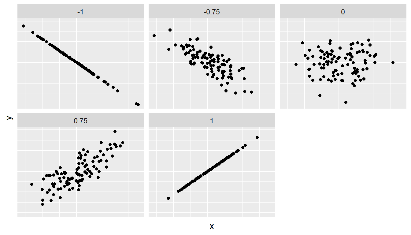
Figure 14.1: Different correlation coefficients
The correlation coefficient is computed using the cor() function, where the inputs to the function are the two numerical variables for which we want to quantify the strength of the linear relationship. Note, however, that because the dataset has missing values for some neighborhoods, if you run cor() without the option use = "pairwise.complete.obs", you will get NA - which is a missing value. See that we add this option below:
atlas_mob_jobs %>%
  summarise(correlation = cor(kfr_pooled_p25, ann_avg_job_growth_2004_2013, use = "pairwise.complete.obs"))
## # A tibble: 1 × 1
## correlation
## <dbl>
## 1 0.0716You can also use the cor() function directly instead of using it inside summarise, but you will need to use the $ syntax to access the specific variables within a data frame (See Subsection 11.7.4):
cor(x = atlas_mob_jobs$ann_avg_job_growth_2004_2013, y = atlas_mob_jobs$kfr_pooled_p25, use = "pairwise.complete.obs")## [1] 0.0716In our case, the correlation coefficient of NA indicates that the relationship between mobility and job growth is “weakly positive” There is a certain amount of subjectivity in interpreting correlation coefficients, especially those that aren’t close to -1, 0, and 1. For help developing such intuition and more discussion on the correlation coefficient see Subsection 14.2.1 below.
Let’s now proceed by visualizing this data. Since both the kfr_pooled_p25 and ann_avg_job_growth_2004_2013 variables are numerical, a scatterplot is an appropriate graph to visualize this data. Let’s do this using geom_point() and set informative axes labels and title and display the result in Figure 14.2.
ggplot(atlas_mob_jobs, aes(x = ann_avg_job_growth_2004_2013, y = kfr_pooled_p25)) +
  geom_point(alpha = 0.2) +
  labs(x = "Average Job Growth Rate 2004-2013", y = "Mobility for Children of Parents in P25",
       title = "Relationship of mobility and job growth")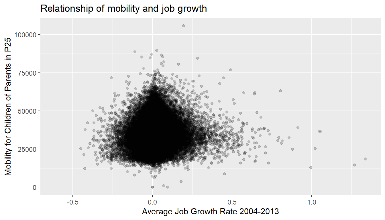
Figure 14.2: Economic mobility for children of parents at percentile 25 across the US
Observe the following:
- Most average job growth rates lie between -0.25 (-25%) and 0.25 (+25%).
- Most mobility outcomes lie between $18,000 and $50,000.
- Recall our earlier computation of the correlation coefficient, which describes the strength of the linear relationship between two numerical variables. Looking at Figure 14.2, it is not immediately apparent that these two variables are positively related. This is to be expected given the positive, but rather weak (close to 0), correlation coefficient of NA.
Going back to scatterplot in Figure 14.2, let’s improve on it by adding a “regression line” in Figure 14.3. This is easily done by adding a new layer to the ggplot code that created Figure 14.2: + geom_smooth(method = "lm"). A regression line is a “best fitting” line in that of all possible lines you could draw on this plot, it is “best” in terms of some mathematical criteria. There is a formal definition for what “best” means, but we do not need to go into detail here. Suffice to say, this line minimizes errors in the prediction in the sense that the square of the distance between our prediction (the line) and the real data.
ggplot(atlas_mob_jobs, aes(x = ann_avg_job_growth_2004_2013, y = kfr_pooled_p25)) +
  geom_point(alpha = 0.2) +
  labs(x = "Average Job Growth Rate 2004-2013", y = "Mobility for Children of Parents in P25",
       title = "Relationship of mobility and job growth") +
  geom_smooth(method = "lm")
## `geom_smooth()` using formula = 'y ~ x'
Figure 14.3: Regression line
When viewed on this plot, the regression line is a visual summary of the relationship between two numerical variables, in our case the outcome variable kfr_pooled_p25 and the explanatory variable ann_avg_job_growth_2004_2013. The positive slope of the blue line is consistent with our observed correlation coefficient of NA suggesting that there is a positive relationship between kfr_pooled_p25 and ann_avg_job_growth_2004_2013. We’ll see later however that while the correlation coefficient is not equal to the slope of this line, they always have the same sign: positive or negative.
You can barely see it. perhaps, but the blue line has some very thin grey bands surrounding it. What are those? These are standard error bands, which can be thought of as error/uncertainty bands. Let’s skip this idea for now and suppress these grey bars by adding the argument se = FALSE to geom_smooth(method = "lm"). We’ll briefly introduce standard errors below, but we can skip that for now.
ggplot(atlas_mob_jobs, aes(x = ann_avg_job_growth_2004_2013, y = kfr_pooled_p25)) +
  geom_point(alpha = 0.2) +
  labs(x = "Average Job Growth Rate 2004-2013", y = "Mobility for Children of Parents in P25",
       title = "Relationship of mobility and job growth") +
  geom_smooth(method = "lm", se = FALSE)
## `geom_smooth()` using formula = 'y ~ x'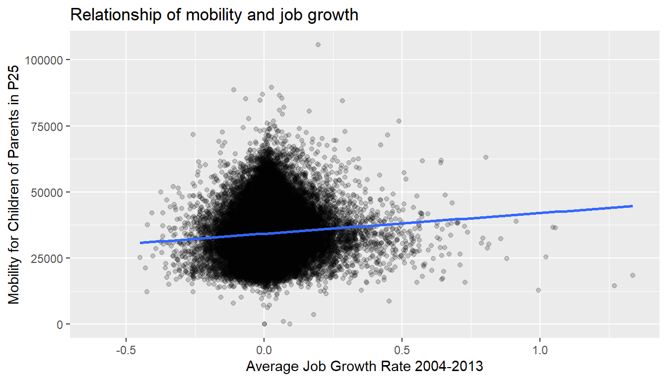
Figure 14.4: Regression line without error bands
Learning check
(LC5.1) Conduct a new exploratory data analysis with the same outcome variable \(y\) being kfr_pooled_p25 but with poor_share2010 as the new explanatory variable \(x\). Remember, this involves three things:
- Looking at the raw values.
- Computing summary statistics of the variables of interest.
- Creating informative visualizations.
What can you say about the relationship between the share of people living under the poverty line in 2010 and mobility measures for children of parents in p25 based on this exploration?
14.1.2 Simple linear regression
You may recall from secondary school / high school algebra, in general, the equation of a line is \(y = a + bx\), which is defined by two coefficients. Recall we defined this earlier as “quantitative expressions of a specific property of a phenomenon.” These two coefficients are:
- the intercept coefficient \(a\), or the value of \(y\) when \(x = 0\), and
- the slope coefficient \(b\), or the increase in \(y\) for every increase of one in \(x\).
However, when defining a line specifically for regression, like the blue regression line in Figure 14.4, we use slightly different notation: the equation of the regression line is \(\widehat{y} = b_0 + b_1 \cdot x\) where
- the intercept coefficient is \(b_0\), or the value of \(\widehat{y}\) when \(x=0\), and
- the slope coefficient \(b_1\), or the increase in \(\widehat{y}\) for every increase of one in \(x\).
Why do we put a “hat” on top of the \(y\)? It’s a form of notation commonly used in regression, which we’ll introduce in the next Subsection ?? when we discuss fitted values. For now, let’s ignore the hat and treat the equation of the line as you would from secondary school / high school algebra recognizing the slope and the intercept. We know looking at Figure 14.4 that the slope coefficient corresponding to ann_avg_job_growth_2004_2013 should be positive. Why? Because as ann_avg_job_growth_2004_2013 increases, professors tend to roughly have higher teaching evaluation kfr_pooled_p25. However, what are the specific values of the intercept and slope coefficients? Let’s not worry about computing these by hand, but instead let the computer do the work for us. Specifically, let’s use R!
Let’s get the value of the intercept and slope coefficients by outputting something called the linear regression table. We will fit the linear regression model to the data using the lm() function and save this to mob_model. lm stands for “linear model.” When we say “fit”, we are saying find the best fitting line to this data.
The lm() function that “fits” the linear regression model is typically used as lm(y ~ x, data = data_frame_name) where:
yis the outcome variable, followed by a tilde (~). This is likely the key to the left of “1” on your keyboard. In our case,yis set tokfr_pooled_p25.xis the explanatory variable. In our case,xis set toann_avg_job_growth_2004_2013. We call the combinationy ~ xa model formula.data_frame_nameis the name of the data frame that contains the variablesyandx. In our case,data_frame_nameis theatlas_mob_jobsdata frame.
##
## Call:
## lm(formula = kfr_pooled_p25 ~ ann_avg_job_growth_2004_2013, data = atlas_mob_jobs)
##
## Coefficients:
##                  (Intercept)  ann_avg_job_growth_2004_2013
##                        34276                          7783
This output is telling us that the Intercept coefficient \(b_0\) of the regression line is 3.8803, and the slope coefficient for by_avg is 0.0666. Therefore the blue regression line in Figure 14.4 is
\[\widehat{\text{mobilityp25}} = b_0 + b_{\text{avg job growth}} \cdot\text{avg job growth} = 34276.27 + 7782.82\cdot\text{ avg job growth}\]
where
The intercept coefficient \(b_0 = 34276.27\) means for instructors that had a hypothetical average job growth of 0, we would expect them to have on average mobility of $ 34,276.
Of more interest is the slope coefficient associated with
ann_avg_job_growth_2004_2013: \(b_{\text{bty avg}} = +7782.82\). This is a numerical quantity that summarizes the relationship between the outcome and explanatory variables. Note that the sign is positive, suggesting a positive relationship between job growth and mobility, meaning as average job growth goes up, so does the mobility measure. The slope’s precise interpretation is:For every increase of 1 unit in
ann_avg_job_growth_2004_2013, there is an associated increase of, on average, 7782.82 units ofkfr_pooled_p25.
A very important point to mention here is that you need to recall that the variable ann_avg_job_growth_2004_2013 is coded such that a 1 unit increment is equivalent to increasing the average annual job growth by 100%. Given that changing the average growth rate by 100% is a very large change, perhaps we should choose a smaller change to get a sense of how much the correlation explains mobility. That is, we can interpret the previous set of results by dividing the coefficient on average job growth rate by 100, and saying:
For every increase of 1% in the average job growth rate
ann_avg_job_growth_2004_2013, there is an associated increase of, on average, 77.82 units ofmobility.
Such interpretations need be carefully worded:
- We only stated that there is an associated increase, and not necessarily a causal increase. For example, perhaps it’s not that job growth directly affects mobility, but instead areas with higher mobility attract firms to locate there, thereby increasing job creation. Avoiding such reasoning can be summarized by the adage “correlation is not necessarily causation.” In other words, just because two variables are correlated, it doesn’t mean one directly causes the other. We discuss these ideas more in Subsection 14.2.2 and in following chapters.
- We say that this associated increase is on average 77.82 dollars of mobility
kfr_pooled_p25and not that the associated increase is exactly 77.82 dollars ofkfr_pooled_p25across all values ofann_avg_job_growth_2004_2013. This is because the slope is the average increase across all points as shown by the regression line in Figure 14.4.
Now that we’ve learned how to compute the equation for the blue regression line in Figure 14.4 and interpreted all its terms, let’s take our modeling one step further. This time after fitting the model using the lm(), let’s get something called the regression table using the summary() function:
# Fit regression model:
mob_model <- lm(kfr_pooled_p25 ~ ann_avg_job_growth_2004_2013, data = atlas_mob_jobs)
# Get regression results:
summary(mob_model)
##
## Call:
## lm(formula = kfr_pooled_p25 ~ ann_avg_job_growth_2004_2013, data = atlas_mob_jobs)
##
## Residuals:
## Min 1Q Median 3Q Max
## -35002 -5437 -719 4656 69932
##
## Coefficients:
## Estimate Std. Error t value Pr(>|t|)
## (Intercept) 34276.3 31.2 1097 <0.0000000000000002 ***
## ann_avg_job_growth_2004_2013 7782.8 409.2 19 <0.0000000000000002 ***
## ---
## Signif. codes: 0 '***' 0.001 '**' 0.01 '*' 0.05 '.' 0.1 ' ' 1
##
## Residual standard error: 8110 on 70230 degrees of freedom
## (3046 observations deleted due to missingness)
## Multiple R-squared: 0.00512, Adjusted R-squared: 0.00511
## F-statistic: 362 on 1 and 70230 DF, p-value: <0.0000000000000002Note how we took the output of the model fit saved in mob_model and used it as an input to the subsequent summary() function. The raw output of the summary() function above gives lots of information about the regression model that we won’t cover in this introductory course (e.g., Multiple R-squared, F-statistic, etc.). We will only consider the “Coefficients” section of the output. We can print these relevant results only by accessing the coefficients object stored in the summary results.
| Estimate | Std. Error | t value | Pr(>|t|) | |
|---|---|---|---|---|
| (Intercept) | 34276 | 31.2 | 1097 | 0 |
| ann_avg_job_growth_2004_2013 | 7783 | 409.2 | 19 | 0 |
For now since we are only using regression as an exploratory data analysis tool, we will only focus on the “Estimate” column that contains the estimates of the intercept and slope for the best fit line for our data. The remaining three columns refer to statistical concepts known as standard errors, t-statistics, and p-values. They are all interrelated, but we will briefly only talk about p-values at the end of this Chapter. For now, we can skip that..
Learning check
(LC5.2) Fit a new simple linear regression using lm(kfr_pooled_p25 ~ poor_share2010, data = atlas_mob_jobs) where poor_share2010 is the new explanatory variable \(x\). Get information about the “best-fitting” line from the regression table by applying the summary() function. How do the regression results match up with the results from your exploratory data analysis above?
Investigating the residuals of these linear regressions is usually a good idea, but I will leave that for your Econometric classes. If you want to see how to explore the residuals in R, you can look here.
14.2 Related topics
14.2.1 Correlation coefficient
Let’s re-plot Figure 14.1, but now consider a broader range of correlation coefficient values in Figure 14.5.
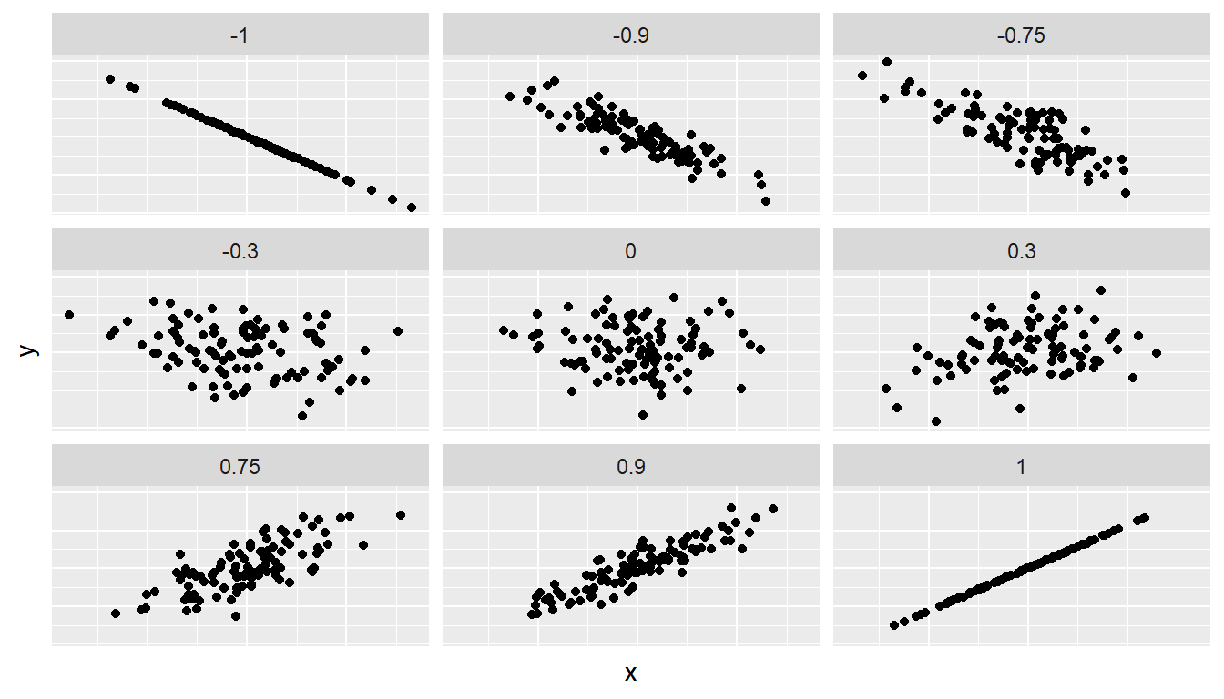
Figure 14.5: Different Correlation Coefficients
As we suggested in Subsection 14.1.1, interpreting coefficients that are not close to the extreme values of -1 and 1 can be subjective. To help develop your sense of correlation coefficients, we suggest you play the following 80’s-style video game called “Guess the correlation” at http://guessthecorrelation.com/.
14.2.2 Correlation is not necessarily causation
You’ll note throughout this chapter we’ve been very cautious in making statements of the “associated effect” of explanatory variables on the outcome variables, for example our statement from Subsection 14.1.2 that “for every increase of 1 unit in ann_avg_job_growth_2004_2013, there is an associated increase of, on average, 7782.823 units of kfr_pooled_p25.” We say this because we are careful not to make causal statements. So while average job growth rate ann_avg_job_growth_2004_2013 is positively correlated with teaching kfr_pooled_p25, it does not imply that it directly cause mobility to increase.
For example, let’s say a neighbrhood has their ann_avg_job_growth_2004_2013 increase, but only after taking steps to try to boost public investment in the area. Does this mean that they will suddenly be a better neighborhood for kids of low income parents? Maybe?
Here is another example, a not-so-great medical doctor goes through their medical records and finds that patients who slept with their shoes on tended to wake up more with headaches. So this doctor declares “Sleeping with shoes on cause headaches!”

Figure 14.6: Does sleeping with shoes on cause headaches?
However as some of you might have guessed, if someone is sleeping with their shoes on it’s probably because they are intoxicated. Furthermore, drinking more tends to cause more hangovers, and hence more headaches.
In this instance, alcohol is what’s known as a confounding/lurking variable. It “lurks” behind the scenes, confounding or making less apparent, the causal effect (if any) of “sleeping with shoes on” with waking up with a headache. We can summarize this notion in Figure 14.7 with a causal graph where:
- Y: Is an outcome variable, here “waking up with a headache.”
- X: Is a treatment variable whose causal effect we are interested in, here “sleeping with shoes on.”
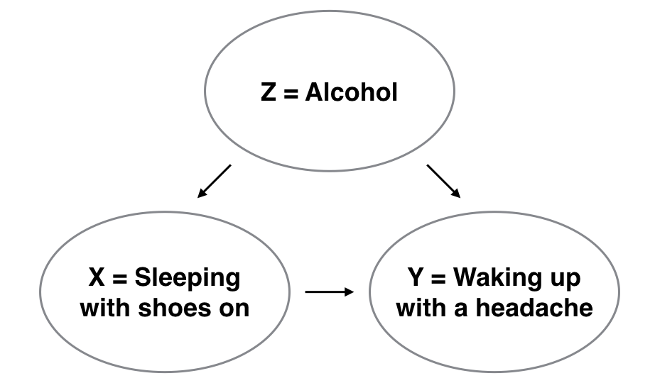
Figure 14.7: Causal graph.
So for example, many such studies use regression modeling where the outcome variable is set to Y and the explanatory/predictor variable is X, much as you’ve started learning how to do in this chapter. However, Figure 14.7 also includes a third variable with arrows pointing at both X and Y.
- Z: Is a confounding variable that affects both X & Y, thus “confounding” their relationship.
So as we said, alcohol will both cause people to be more likely to sleep with their shoes on as well as more likely to wake up with a headache. Thus when evaluating what causes one to wake up with a headache, its hard to tease out the effect of sleeping with shoes on versus just the alcohol. Thus our model needs to also use Z as an explanatory/predictor variable as well, in other words our doctor needs to take into account who had been drinking the night before. We’ll start covering multiple regression models that allows us to incorporate more than one variable in the next chapter.
Establishing causation is a tricky problem and frequently takes either carefully designed experiments or methods to control for the effects of potential confounding variables. Both these approaches attempt either to remove all confounding variables or take them into account as best they can, and only focus on the behavior of an outcome variable in the presence of the levels of the other variable(s). Be careful as you read studies to make sure that the writers aren’t falling into this fallacy of correlation implying causation. If you spot one, you may want to send them a link to Spurious Correlations.
14.3 Two numerical explanatory variables
Let’s first consider a multiple regression model with two numerical explanatory variables. We will continue with our previous example coming from the atlas data.
In this section, we’ll fit a regression model where we have
- A numerical outcome variable \(y\), the mobility measure for children of parents in the percentile 25th.
- Two explanatory variables:
- One numerical explanatory variable \(x_1\), average job growth rate between 2003 and 2014.
- Another numerical explanatory variable \(x_2\), the percentage of the population below the poverty line in 2010.
14.3.1 Exploratory data analysis
Let’s do something similar to what we did before, but include the variable of the share of the population below the poverty line in 2010 poor_share2010 in the data that we keep track off, and call it atlas_mob_jobs_poor.
atlas_mob_jobs_poor <- atlas %>%
  select(tract, county, state, kfr_pooled_p25, ann_avg_job_growth_2004_2013, poor_share2010)
Recall the three common steps in an exploratory data analysis we saw in Subsection 14.1.1:
- Looking at the raw data values.
- Computing summary statistics.
- Creating data visualizations.
Let us know skim the data with the skim() function:
atlas_mob_jobs_poor %>%
  select(kfr_pooled_p25, ann_avg_job_growth_2004_2013, poor_share2010) %>%
  skim()
Skim summary statistics
n obs: 73278
n variables: 2
── Variable type:numeric ───────────────────────────────────────────────────────
variable missing complete n mean sd p0 p25 p50 p75 p100
kfr_pooled_p25 1267 0.983 34443. 8169. 0 28973 33733. 39167. 105732.
ann_avg_job_growth_2004_2013 2614 0.964 0.0153 0.0762 -0.607 -0.0189 0.00850 0.0410 1.34
poor_share2010 345 0.995 0.151 0.127 0 0.0591 0.116 0.205 1Observe the summary statistics for the min and max of the variable poor_share2010 are 0 and 1, respectively. This should be a flag for you that the share is once more measured as 0 being 0% and 1 being 100%. Note that the average share of population living below the poverty line in 2010 is 15.1%, and that 25% of neighborhoods have a poverty share of 5.91% or less, while 75% of neighborhoods had a poverty share of 20.5% or less.
Since our outcome variable kfr_pooled_p25 and the explanatory variables ann_avg_job_growth_2004_2013 and poor_share2010 are numerical, we can compute the correlation coefficient between the different possible pairs of these variables. First, we can run the cor() command as seen in Subsection 14.1.1 twice, once for each explanatory variable:
cor(atlas_mob_jobs_poor$kfr_pooled_p25, atlas_mob_jobs_poor$ann_avg_job_growth_2004_2013, use = "pairwise.complete.obs")

cor(atlas_mob_jobs_poor$kfr_pooled_p25, atlas_mob_jobs_poor$poor_share2010, use = "pairwise.complete.obs")
Or we can simultaneously compute them by returning a correlation matrix which we display in Table 14.4. We can read off the correlation coefficient for any pair of variables by looking them up in the appropriate row/column combination.
atlas_mob_jobs_poor %>%
  select(kfr_pooled_p25, ann_avg_job_growth_2004_2013, poor_share2010) %>%
cor()| kfr_pooled_p25 | ann_avg_job_growth_2004_2013 | poor_share2010 | |
|---|---|---|---|
| kfr_pooled_p25 | 1.000 | 0.072 | -0.544 |
| ann_avg_job_growth_2004_2013 | 0.072 | 1.000 | -0.063 |
| poor_share2010 | -0.544 | -0.063 | 1.000 |
For example, the correlation coefficient of:
kfr_pooled_p25with itself is 1 as we would expect based on the definition of the correlation coefficient.kfr_pooled_p25withann_avg_job_growth_2004_2013is 0.072. This indicates a very weak positive linear relationship.kfr_pooled_p25withpoor_share2010is -0.544. This is suggestive of a strong negative linear relationship. At least, much stronger than the one betweenkfr_pooled_p25andann_avg_job_growth_2004_2013.- As an added bonus, we can read off the correlation coefficient between the two explanatory variables of
ann_avg_job_growth_2004_2013andpoor_share2010as -0.063.
Let’s visualize the relationship of the outcome variable with each of the two explanatory variables in two separate plots in Figure 14.8.
ggplot(atlas_mob_jobs_poor, aes(x = ann_avg_job_growth_2004_2013, y = kfr_pooled_p25)) +
  geom_point(alpha = 0.2) +
  labs(x = "Average Job Growth 2003-2014", y = "Mobility for Children of Parents in P25 (in $)",
       title = "Mobility and job growth") +
  geom_smooth(method = "lm", se = FALSE)

ggplot(atlas_mob_jobs_poor, aes(x = poor_share2010, y = kfr_pooled_p25)) +
  geom_point(alpha = 0.2) +
  labs(x = "Proverty Share in 2010", y = "Mobility for Children of Parents in P25 (in $)",
       title = "Mobility and poverty share") +
  geom_smooth(method = "lm", se = FALSE)
## `geom_smooth()` using formula = 'y ~ x'
## `geom_smooth()` using formula = 'y ~ x'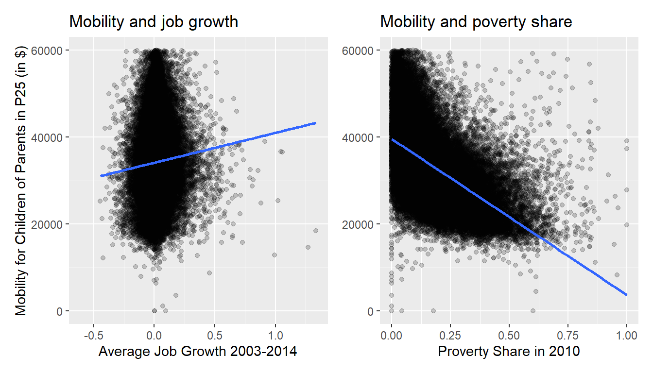
Figure 14.8: Relationship between mobility and job growth/poverty share.
Observe there is a weak positive relationship between mobility and job growth: as job growth increases so also does mobility but in a fairly flat rate. This is consistent with the weak positive correlation coefficient of 0.072 we computed earlier. In the case of poverty share, the strong negative relationship appear here, which depicts the -0.544 correlation coefficient that we estimated above.
However, the two plots in Figure 14.8 only focus on the relationship of the outcome variable with each of the two explanatory variables separately. To visualize the joint relationship of all three variables simultaneously, we need a 3-dimensional (3D) scatterplot as seen in Figure 14.9. Because there are many datapoints in the atlas data, I subset this to data for the state of North Carolina (state==37). These points in the atlas_mob_jobs_poor data frame are marked with a blue point where
- The numerical outcome variable \(y\)
kfr_pooled_p25is on the vertical axis - The two numerical explanatory variables, \(x_1\)
poor_share2010and \(x_2\)ann_avg_job_growth_2004_2013, are on the two axes that form the bottom plane.
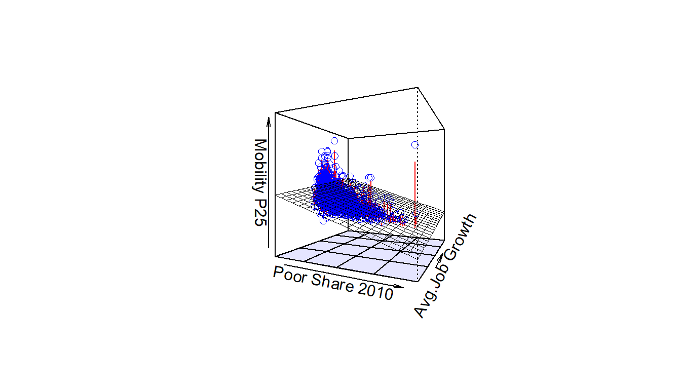
Figure 14.9: 3D scatterplot and regression plane.
Furthermore, we also include the regression plane. Recall from above that regression lines are “best-fitting” in that of all possible lines we can draw through a cloud of points, the regression line minimizes the sum of squared residuals. This concept also extends to models with two numerical explanatory variables. The difference is instead of a “best-fitting” line, we now have a “best-fitting” plane that similarly minimizes the sum of squared residuals. Head to here to open an interactive version of similar plane (using different data) in your browser.
14.3.2 Regression plane
Let’s now fit a regression model and get the regression table corresponding to the regression plane in Figure 14.9. We’ll consider a model fit with a formula of the form y ~ x1 + x2, where x1 and x2 represent our two explanatory variables ann_avg_job_growth_2004_2013 and poor_share2010.
Just like we did in Chapter 14, let’s get the regression table for this model using our two-step process and display the results in Table 14.5.
- We first “fit” the linear regression model using the
lm(y ~ x1 + x2, data)function and save it inmob_model2. - We get the regression table by applying the
summary()function tomob_model2.
# Fit regression model:
mob_model2 <- lm(kfr_pooled_p25 ~ ann_avg_job_growth_2004_2013 + poor_share2010, data = atlas_mob_jobs_poor)
# Get regression table:
summary(mob_model2)$coefficients| Estimate | Std. Error | t value | Pr(>|t|) | |
|---|---|---|---|---|
| (Intercept) | 39714 | 41.4 | 959.1 | 0 |
| ann_avg_job_growth_2004_2013 | 3684 | 345.4 | 10.7 | 0 |
| poor_share2010 | -36371 | 214.1 | -169.8 | 0 |
Let’s interpret the three values in the Estimate column. First, the Intercept value is -$39,714. This intercept represents the mobility for children of parents in p25 in neighborhoods in which ann_avg_job_growth_2004_2013 is 0% and poor_share2010 of 0%. In our data however, the intercept has limited practical interpretation since no neighborhood had ann_avg_job_growth_2004_2013 or poor_share2010 values of 0%. Rather, the intercept is used to situate the regression plane in 3D space.
Second, the ann_avg_job_growth_2004_2013 value is $3,684. Taking into account all the other explanatory variables in our model, if you increase job growth in a neighborhood from 0% to 100% (ann_avg_job_growth_2004_2013 from 0 to 1 unit), there is an associated increase of on average $3,684 in economic mobility for p25. Notice once more, that this is equivalent to saying that increasing job growth by 1% has an associated average increase of mobility of $36.84 - which definitely seems like a small amount. Just as we did in Subsection 14.1.2, we are cautious to not imply causality as we saw in Subsection 14.2.2 that “correlation is not necessarily causation.” We do this merely stating there was an associated increase.
Furthermore, we preface our interpretation with the statement “taking into account all the other explanatory variables in our model.” Here, by all other explanatory variables we mean poor_share2010. We do this to emphasize that we are now jointly interpreting the associated effect of multiple explanatory variables in the same model at the same time.
Third, poor_share2010 = -$36,371. Taking into account all the other explanatory variables in our model, for every increase of one unit in the variable poor_share2010, in other words decreasing the share poor in a neighborhood from 0% to 100%, there is an associated decrease of on average $36,371 in mobility. Once more, this is equivalent to saying that a reduction of 1% in the share poor is associated with an increase of $363.71 in economic mobility.
Putting these results together, the equation of the regression plane that gives us fitted values \(\widehat{y}\) = \(\widehat{\text{mobility}}\) is:
\[ \begin{aligned} \widehat{y} &= b_0 + b_1 \cdot x_1 + b_2 \cdot x_2\\ \widehat{\text{mobility}} &= b_0 + b_{\text{avg job growth}} \cdot \text{avg job growth} + b_{\text{pov rate}} \cdot \text{pov rate}\\ &= 39714 + 3684 \cdot\text{avg job growth} - 36371 \cdot\text{pov rate} \end{aligned} \]
Recall in the right-hand plot of Figure 14.8 that when plotting the relationship between kfr_pooled_p25 and poor_share2010 in isolation, there appeared to be a positive relationship of. In the last discussed multiple regression however, when jointly modeling the relationship between kfr_pooled_p25, ann_avg_job_growth_2004_2013, and poor_share2010, there appears to be a weaker positive relationship of kfr_pooled_p25 and ann_avg_job_growth_2004_2013 as evidenced by the slope for ann_avg_job_growth_2004_2013 of $3,684 versus the initial $7,783.
14.4 How to read p-values
Now that you know what the coefficients in a regression table mean, let’s briefly discuss now how to asses if the relationship you estimated (the coefficients) estimated with sufficient precision or not. Let’s recap our latest regression table. We had this:
##                              Estimate Std. Error t value                       Pr(>|t|)
## (Intercept)                     39714       41.4   959.1 0.0000000000000000000000000000
## ann_avg_job_growth_2004_2013     3684      345.4    10.7 0.0000000000000000000000000152
## poor_share2010                 -36371      214.1  -169.8 0.0000000000000000000000000000
We will now focus on the last column of these tables - the one that says Pr(>|t|). These numbers are called p-values. This is a big topic and I will not do it justice. In fact, I will be very loose in this explanation as this is not a course in statistics, but I do want to give you the intuition for how to read it. If you want to dig more, please see here and here.
In essence, when we run a regression like the one above, we usually have at hand a sample of observations out of a universe. For example, in the atlas instance, we do not have information on all the neighborhoods in the US, although we do have most of them in the data. But that means that we could have ended with a different set of observations (or neighborhoods) in an alternative world that is slightly different from the one we actually see.
To assess how much of an issue this is, we use p-values. I will not get into any details of how you can calculate p-values, but the idea is fairly simple: a p-value is the probability that you would observe data that is as extreme as the data you do if, in fact, the true slope (or coefficient) was zero.
Put another way, if we imagine that there is absolutely no real relationship between our variable(s) \(x\) and our outcome \(y\), how often would we find data that looks like this or even more extreme in the apparent relationship? The answer is the p-value. Why is that useful? Because if the p-value is sufficiently low it is a very simple way to assess our confidence in the slope we are estimating.
Important!
p-values: probability that you would observe data that is as extreme as the data you do if, in fact, the true slope (or coefficient) were zero.
interpretation: rule of thumb is to say that numbers below 0.05 are evidence that the slope is not produced by random chance.
14.4.1 An Example
Let’s present our latest regression table for the multivariate case once more. We had this table:
##                              Estimate Std. Error t value                       Pr(>|t|)
## (Intercept)                     39714       41.4   959.1 0.0000000000000000000000000000
## ann_avg_job_growth_2004_2013     3684      345.4    10.7 0.0000000000000000000000000152
## poor_share2010                 -36371      214.1  -169.8 0.0000000000000000000000000000
Notice that the p-values for all three estimates (the intercept, and our coefficients for ann_avg_job_growth_2004_2013 and poor_share2010) are 0. What does that mean? Well, that means that it would be very very unlikely that we could get data like the one we have (or more extreme) if the intercept was 0, or if the coefficient of ann_avg_job_growth_2004_2013 were 0, or if the coefficient for poor_share2010 was 0. That is, in a loose way, we believe these estimates are not just coincidence. If those numbers would be higher than 0.05 we should perhaps trust those numbers a bit less, as there would be a higher probability that they were produced almost by chance.
14.5 Conclusion
14.5.1 Additional resources
As we suggested in Subsection 14.1.1, interpreting coefficients that are not close to the extreme values of -1, 0, and 1 can be somewhat subjective. To help develop your sense of correlation coefficients, we suggest you play the following 80’s-style video game called “Guess the correlation” at http://guessthecorrelation.com/.