Project 1
Stories from the Atlas: Describing Data using Maps, Regressions, and Correlations
Posted: Monday, August 21, 2023
Part 1: Due at midnight on Wednesday, September 6, 2023
Part 2: Due at midnight on Friday, September 15, 2023
The Opportunity Atlas is a freely available interactive mapping tool that traces the roots of outcomes such as poverty and incarceration back to the neighborhoods in which children grew up.
Policymakers, journalists, and the public have begun to explore the Opportunity Atlas, casting new light on the geography of upward mobility in communities across the country. As an example, see Jasmine Garsd’s analysis for the New York City neighborhood of Brownsville in Brooklyn.
In this first empirical project, you will use the Opportunity Atlas mapping tool and the underlying data to describe equality of opportunity in your hometown and across the United States. (If you grew up outside the United States, you may select a community in which you have spent some time, such as San Antonio, TX.)
The end product will be a short narrative (or story) in which you describe what you have learned from the Atlas, in which you will weave in the narrative along with the data analysis. Below is a list of specific analyses and questions that your narrative must address. The document should contain references, graphs, and maps.
This project focuses on the following methods for descriptive data analysis. (The later empirical projects you will do in this class will be focused on causal inference and prediction).
Data visualization. Maps are a powerful way to present descriptive statistics for data with a geographic component. You will use maps to display upward mobility statistics for the Census tracts in your hometown.
Regression and correlation analysis. You will use linear regressions and correlation coefficients to quantify the statistical relationship between upward mobility and potential explanatory variables.
The R data file that you will use in this assignment, atlas.rds, contains an extract of the Opportunity Atlas data. It is also merged on several other variables, which you may use for the correlational analysis.
You can load the data by using the usual line:
Instructions
You will work on RStudio through Posit Cloud for this project. Write the narrative within a Quarto file in the project1 tab in Posit Cloud, and upload the final pdf document to Canvas.
The deliverables for Part 1 and Part 2 are the following:
- Part 1: points 1 to 5
- Part 2: points 1 to 10 - this should include any feedback you received for Part 1
Notice that Part 2 includes Part 1
I created a Section to help you get up to speed with Quarto/RMarkdown here. The Quarto/RMarkdown file is where you will write your narrative, run all your analysis, and the output of each code block should be visible. The output should include references, graphs, maps, and tables.
Specific questions to address in your narrative
- Start by looking up the city where you grew up on the Opportunity Atlas. Zoom in to the Census tracts around your home.
Figure 1 in your narrative should be a map of the Census tracts in your hometown from the Opportunity Atlas. Examples for Milwaukee, WI (where Professor Chetty grew up) and Los Angeles, CA (discussed in Lecture 1) are shown on the next page. The text of your narrative should describe what you see, and what data are being visualized.
Examine the patterns for a number of different groups (e.g., lowest income children, high income children) and outcomes (e.g., earnings in adulthood, incarceration rates). Only choose one or two of these to include in your narrative.
(To answer this question, read the Opportunity Atlas manuscript) What period do the data you are analyzing come from? Are you concerned that the neighborhoods you are studying may have changed for kids now growing up there? What evidence do Chetty et al. (2018) provide suggesting that such changes are or are not important? What type of data could you use to test whether your neighborhood has changed in recent years?
Now turn to the
atlas.rdsdata set. How does average upward mobility, pooling races and genders, for children with parents at the 25th percentile (kfr pooled_p25) in your home Census tract compare to mean (population-weighted, usingcount_pooled) upward mobility in your state and in the U.S. overall? Do kids where you grew up have better or worse chances of climbing the income ladder than the average child in America?
Hint: The Opportunity Atlas website will give you the tract, county, and state FIPS codes for your home address. For example, searching for “Lynwood Road, Verona, New Jersey” will display Tract 34013021000, Verona, NJ. The first two digits refer to the state code, the next three digits refer to the county code, and the last 6 digits refer to the tract code. In R, you can list these observations with the function filter() as follows (assuming you called the data as atlas as in Table 2). If you only want to see kfr_pooled_p25:
atlas_lynwood<-atlas%>%
  filter(state == 34 & county == 013 & tract == 021000)

atlas_lynwood%>%
  select(kfr_pooled_p25)
Or to see all the variables for that tract:
See the Cheat-sheet Section below for further help.
What is the standard deviation of upward mobility (population-weighted) in your home county? Is it larger or smaller than the standard deviation across tracts in your state? Across tracts in the country? What do you learn from these comparisons?
Now let’s turn to downward mobility: repeat questions (3) and (4) looking at children who start with parents at the 75th and 100th percentiles. How do the patterns differ?
Using a linear regression, estimate the relationship between outcomes of children at the 25th and 75th percentile for the Census tracts in your home county. Generate a scatter plot to visualize this regression. Do areas where children from low-income families do well generally have better outcomes for those from high-income families, too?
Next, examine whether the patterns you have looked at above are similar by race. If there is not enough racial heterogeneity in the area of interest (i.e., data is missing for most racial groups), then choose a different area to examine.
Using the Census tracts in your home county, can you identify any covariates which help explain some of the patterns you have identified above? Some examples of covariates you might examine include housing prices, income inequality, fraction of children with single parents, job density, etc. For 2 or 3 of these, report estimated correlation coefficients along with their 95% confidence intervals.
Open question: formulate a hypothesis for why you see the variation in upward mobility for children who grew up in the Census tracts near your home and provide correlational evidence testing that hypothesis.
For this question, many covariates have been provided to you in the atlas.rds file, which are described in the Table under the Data Description section.
- Putting together all the analyses you did above, what have you learned about the determinants of economic opportunity where you grew up? Identify one or two key lessons or takeaways that you might discuss with a policymaker or journalist if asked about your hometown. Mention any important caveats to your conclusions; for example, can we conclude that the variable you identified as a key predictor in the question above has a causal effect (i.e., changing it would change upward mobility) based on that analysis? Why or why not?
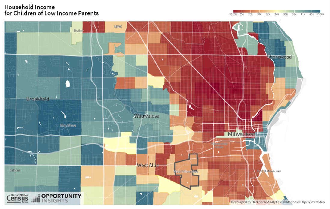
Figure A.1: Household Income in Adulthood for Children Raised in Low-Income Households in Milwaukee, WI
Notes: This figure shows household income at ages 31-37 for low income children who grew up in Census tracts near Milwaukee, WI. The image was saved from www.opportunity-atlas.org by first searching for “Milwaukee, WI” and then clicking on the “download as image” button.
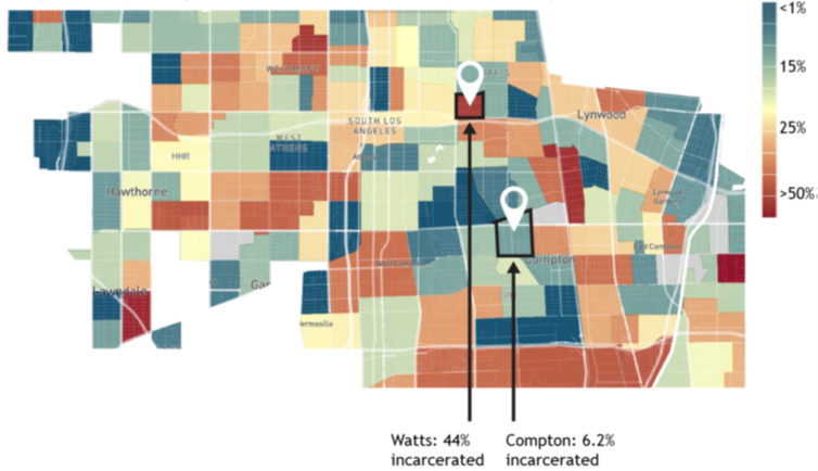
Figure A.2: Incarceration Rates for Black Men Raised in the Lowest-Income Households in Los Angeles, CA
Notes: This figure is from the non-technical summary of the Opportunity Atlas and was discussed in Section @ref(lec1_geomobility).
Data Description
The data consist of n = 73,278 U.S. Census tracts. For more details on the construction of the variables included in this data set, please see Chetty, Raj, John Friedman, Nathaniel Hendren, Maggie R. Jones, and Sonya R. Porter. 2018. “The Opportunity Atlas: Mapping the Childhood Roots of Social Mobility.”, NBER Working Paper No. 25147.
Table 1
Definitions of Variables in atlas.rds
| Variable name | Label | Obs. |
|---|---|---|
| (1) | (2) | (3) |
| 1. Geographic identifiers | ||
| tract | Tract FIPS Code (6-digit) 2010 | 73,278 |
| county | County FIPS Code (3-digit) | 73,278 |
| state | State FIPS Code (2-digit) | 73,278 |
| cz | Commuting Zone Identifier (1990 Definition) | 72,473 |
| 2. Characteristics of Census tracts | ||
| hhinc_mean2000 | Mean Household Income 2000 | 72,302 |
| mean_commutetime2000 | Average Commute Time of Working Adults in 2000 | 72,313 |
| frac_coll_plus2010 | Fraction of Residents with a College Degree or More in 2010 | 72,993 |
| frac_coll_plus2000 | Fraction of Residents with a College Degree or More in 2000 | 72,343 |
| foreign_share2010 | Share of Population Born Outside the U.S. | 72,279 |
| med_hhinc2016 | Median Household Income in 2016 | 72,763 |
| med_hhinc1990 | Median Household Income in 1999 | 72,313 |
| popdensity2000 | Population Density (per square mile) in 2000 | 72,469 |
| poor_share2010 | Poverty Rate 2010 | 72,933 |
| poor_share2000 | Poverty Rate 2000 | 72,315 |
| poor_share1990 | Poverty Rate 1990 | 72,323 |
| share_black2010 | Share black 2010 | 73,111 |
| share_hisp2010 | Share Hispanic 2010 | 73,111 |
| share_asian2010 | Share Asian 2010 | 71,945 |
| share_black2000 | Share black 2000 | 72,368 |
| share_white2000 | Share white 2000 | 72,368 |
| share_hisp2000 | Share Hispanic 2000 | 72,368 |
| share_asian2000 | Share Asian 2000 | 71,050 |
| gsmn_math_g3_2013 | Average School District Level Standardized Test Scores in 3rd Grade in 2013 | 72,090 |
| rent_twobed2015 | Average Rent for Two-Bedroom Apartment in 2015 | 56,607 |
| singleparent_share2010 | Share of Single-Headed Households with Children 2010 | 72,564 |
| singleparent_share1990 | Share of Single-Headed Households with Children 1990 | 72,196 |
| singleparent_share2000 | Share of Single-Headed Households with Children 2000 | 72,285 |
| traveltime15_2010 | Share of Working Adults w/ Commute Time of 15 Minutes Or Less in 2010 | 72,939 |
| emp2000 | Employment Rate 2000 | 72,344 |
| mail_return_rate2010 | Census Form Rate Return Rate 2010 | 72,547 |
| ln_wage_growth_hs_grad | Log wage growth for HS Grad., 2005-2014 | 51,635 |
| jobs_total_5mi_2015 | Number of Primary Jobs within 5 Miles in 2015 | 72,311 |
| jobs_highpay_5mi_2015 | Number of High-Paying (>USD40,000 annually) Jobs within 5 Miles in 2015 | 72,311 |
| nonwhite_share2010 | Share of People who are not white 2010 | 73,111 |
| popdensity2010 | Population Density (per square mile) in 2010 | 73,194 |
| ann_avg_job_growth_2004_2013 | Average Annual Job Growth Rate 2004-2013 | 70,664 |
| job_density_2013 | Job Density (in square miles) in 2013 | 72,463 |
| 3. Measures of Upward Mobility from the Opportunity Atlas | ||
| kfr_pooled_p25 | Household income ($) at age 31-37 for children with parents at the 25th percentile of the national income distribution | 72,011 |
| kfr_pooled_p75 | Household income ($) at age 31-37 for children with parents at the 75th percentile of the national income distribution | 72,012 |
| kfr_pooled_p100 | Household income ($) at age 31-37 for children with parents at the 100th percentile of the national income distribution | 71,968 |
| kfr_natam_p25 | Household income ($) at age 31-37 for Native American children with parents at the 25th percentile of the national income distribution | 1,733 |
| kfr_natam_p75 | Household income ($) at age 31-37 for Native American children with parents at the 75th percentile of the national income distribution | 1,728 |
| kfr_natam_p100 | Household income ($) at age 31-37 for Native American children with parents at the 100th percentile of the national income distribution | 1,594 |
| kfr_asian_p25 | Household income ($) at age 31-37 for Asian children with parents at the 25th percentile of the national income distribution | 15,434 |
| kfr_asian_p75 | Household income ($) at age 31-37 for Asian children with parents at the 75th percentile of the national income distribution | 15,360 |
| kfr_asian_p100 | Household income ($) at age 31-37 for Asian children with parents at the 100th percentile of the national income distribution | 13,480 |
| kfr_black_p25 | Household income ($) at age 31-37 for Black children with parents at the 25th percentile of the national income distribution | 34,086 |
| kfr_black_p75 | Household income ($) at age 31-37 for Black children with parents at the 75th percentile of the national income distribution | 34,049 |
| kfr_black_p100 | Household income ($) at age 31-37 for Black children with parents at the 100th percentile of the national income distribution | 32,536 |
| kfr_hisp_p25 | Household income ($) at age 31-37 for Hispanic children with parents at the 25th percentile of the national income distribution | 37,611 |
| kfr_hisp_p75 | Household income ($) at age 31-37 for Hispanic children with parents at the 75th percentile of the national income distribution | 37,579 |
| kfr_hisp_p100 | Household income ($) at age 31-37 for Hispanic children with parents at the 100th percentile of the national income distribution | 35,987 |
| kfr_white_p25 | Household income ($) at age 31-37 for white children with parents at the 25th percentile of the national income distribution | 67,978 |
| kfr_white_p75 | Household income ($) at age 31-37 for white children with parents at the 75th percentile of the national income distribution | 67,968 |
| kfr_white_p100 | Household income ($) at age 31-37 for white children with parents at the 100th percentile of the national income distribution | 67,627 |
| 3. Counts of number of children under 18 in 2000 (to calculate weighted summary statistics) | ||
| count_pooled | Count of all children | 72,451 |
| count_white | Count of White children | 72,451 |
| count_black | Count of Black children | 72,451 |
| count_asian | Count of Asian children | 72,451 |
| count_hisp | Count of Hispanic children | 72,451 |
| count_natam | Count of Native American children | 72,451 |
Cheatsheat commands
R command Description
Here I present a summary of the commands you could use to work on this project. There are two important issues you should keep in mind while reading this:
- Notice that whenever you see
yvarthis is not a real variable. It is only a place holder for the appropriate variable that you decide to analyze or use. For example, if you want to see the mean across neighborhoods of the average household income as measured in 2000, you would not domean(atlas$yvar, na.rm=TRUE)butmean(atlas$hhinc_mean2000, na.rm=TRUE).
Important!
‘yvar’ is not a real variable. You should replace it for the appropriate variable in your code.
- The data
atlashas missing information for some neighborhoods for some variables. These are calledNAor missing. Most R functions do not like that you include missings in the function, because R does not know what to do with that. What is5+NA? NA !! So, for many of these functions, we will explicitely tell R to ignore NAs. That is what the optionna.rm=TRUEdoes. It does not not exist for every function, but it does for most of the ones we will use here.
Important!
Careful with missing values (also called ‘NA’)! We will use ‘na.rm=TRUE’ as an option for several functions to tell R to ignore the missings.
Load package
If you wanted to install and open the package Hmisc (which you will need to calculate the weighted statistics), run:
Weighted summary statistics
You can weight means or other statistics. In our case, we want to use the population weighted statistics in several cases. That is, we want to put more weight on the value of a tract in which more people live than in another with lower population. Recall that the population variable is count_pooled.
- Weighted mean:
- Weighted standard deviation:
Subset observations
- State level:
If you want to select a subset of observations, you can add the rule for selecting those observations, and the filter function. Here we subset the observations for the State of Wisconsin, and called the resulting dataset atlas_wisconsin.
- County level:
We can do the same but now for a specific county, adding an extra rule after a comma , or &. Here we subset the observations for Milwaukee County in Wisconsin:
Standardize variables
You can standardize variables by substracting the mean and dividing by the standard deviation. Let us say that you want to standardize only considering the variables in Milwaukee, then you can do this:
atlas_milwaukee<- atlas_milwaukee %>%
  mutate(x_std=(xvar - mean(atlas_milwaukee$xvar, na.rm=TRUE))/sd(atlas_milwaukee$xvar, na.rm=TRUE))
As an example, let’s say you want to standardize both the measure of mobility and the annual job growth for the data in Wisconsin:
atlas_wisconsin<- atlas_wisconsin %>%
  mutate(kfr_pooled_p25_std=(kfr_pooled_p25 - mean(atlas_wisconsin$kfr_pooled_p25, na.rm=TRUE))/sd(atlas_wisconsin$kfr_pooled_p25, na.rm=TRUE),
         ann_avg_job_growth_2004_2013_std=(ann_avg_job_growth_2004_2013 - mean(atlas_wisconsin$ann_avg_job_growth_2004_2013, na.rm=TRUE))/sd(atlas_wisconsin$ann_avg_job_growth_2004_2013, na.rm=TRUE))
Run regression
I have written a whole section explaining regression in more detail: Section 14. Please see that for further details. But here is a quick help.
- Simple linear regression
Let’s say you want to run a simple regression of variable yvar on variable xvar1 for the county of Milwaukee. We will save the results of that regression in an object call mod1 (we could give it any name). Then you would do this:
To see what the outcome of the regression is, you would use the function summary and apply it to our new object mod1, like this:
As an example, we could regress the mobility of children from parents in the 25th percentile (kfr_pooled_p25) on the average annual job growth rate between 2004 and 2013 (ann_avg_job_growth_2004_2013). To do that, we would run:
- Multivariate linear regression
You might want to understand the relationship between yvar and variable xvar1 while holding fixed another variable xvar2 for neighborhoods only in Milwaukee. You can do this:
How to read the regression output?
To simplify the interpretation, let’s run a regression where you use the standardize both the measure of mobility and the annual job growth for the data in Wisconsin:
mod3 <- lm(kfr_pooled_p25_std ~ ann_avg_job_growth_2004_2013_std, data = atlas_wisconsin)
summary(mod3)
##
## Call:
## lm(formula = kfr_pooled_p25_std ~ ann_avg_job_growth_2004_2013_std,
## data = atlas_wisconsin)
##
## Residuals:
## Min 1Q Median 3Q Max
## -2.829 -0.569 0.035 0.684 5.128
##
## Coefficients:
## Estimate Std. Error t value Pr(>|t|)
## (Intercept) -0.00000978 0.02681564 0.00 1.000
## ann_avg_job_growth_2004_2013_std -0.05131843 0.02679889 -1.91 0.056 .
## ---
## Signif. codes: 0 '***' 0.001 '**' 0.01 '*' 0.05 '.' 0.1 ' ' 1
##
## Residual standard error: 0.999 on 1386 degrees of freedom
## (6 observations deleted due to missingness)
## Multiple R-squared: 0.00264, Adjusted R-squared: 0.00192
## F-statistic: 3.67 on 1 and 1386 DF, p-value: 0.0557You should focus here on interpreting the coefficient for ann_avg_job_growth_2004_2013_std. You should pay attention to both the magnitude of the number, and the sign. In this case, you would read it like this:
In Wisconsin, increasing one standard deviation the average annual job growth rate is correlated with an reduction of 0.05 standard deviations in the economic mobility for children with parents in the 25th percertile.
Plotting the linear relationship
You need to load the ggplot2 package (which should be installed already).
Suppose you want to visually see the linear relationship between two variables in the atlas_milwaukee dataset that we filtered above. Then, you can do this:
ggplot(data = atlas_milwaukee) + geom_point(aes(x = xvar1, y = yvar)) +
  geom_smooth(aes(x = xvar1, y = yvar), method = "lm", se = F)
The function geom_smooth() adds the line that you calculated above for mod1, where you ran mod1 <- lm(yvar~xvar1, data = atlas_milwaukee).
For more, see Section 12.